Project:
Xenon
(2009 – ...)
Client : Xenon Kiteboards
Market : global
Status : implemented
Scope : identity | branding | art direction |
︎ : courtesy of Xenon
︎ : xenonboards.com
A
Changing the face of kiteboarding since 2009.
This small but passionate company has been making big waves in the kiteboard industry. Largely thanks to a thought through, holistic vision which is being consistently carried out to this day, despite transient trends.
Back when kiteboards looked like cheap postcards from Hawaii or album covers of mediocre punk bands, Xenon burst on the scene boasting a minimalistic design aesthetic. Tribal motives, palm trees, flames, pin-up gals, and skulls made way for clean lines, basic shapes, abstract compositions, color blocks, and simple typography which don’t neccesarily pop to mind when thinking about an extreme sports brand. This fresh design approach combined with product quality, outstanding performance, and uncompromised consistency has helped position this brand on the global scene as one for people who are always looking for more.


︎
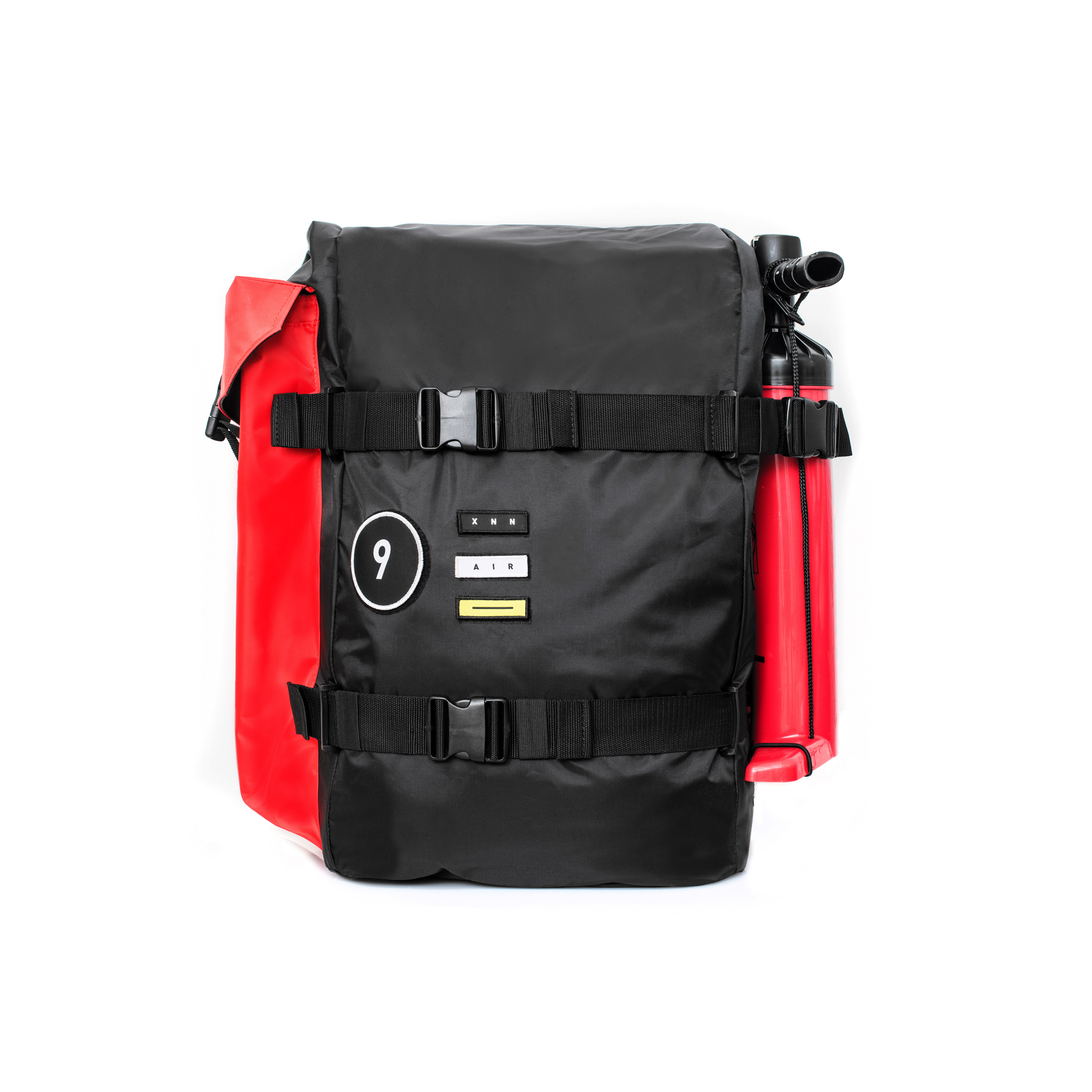
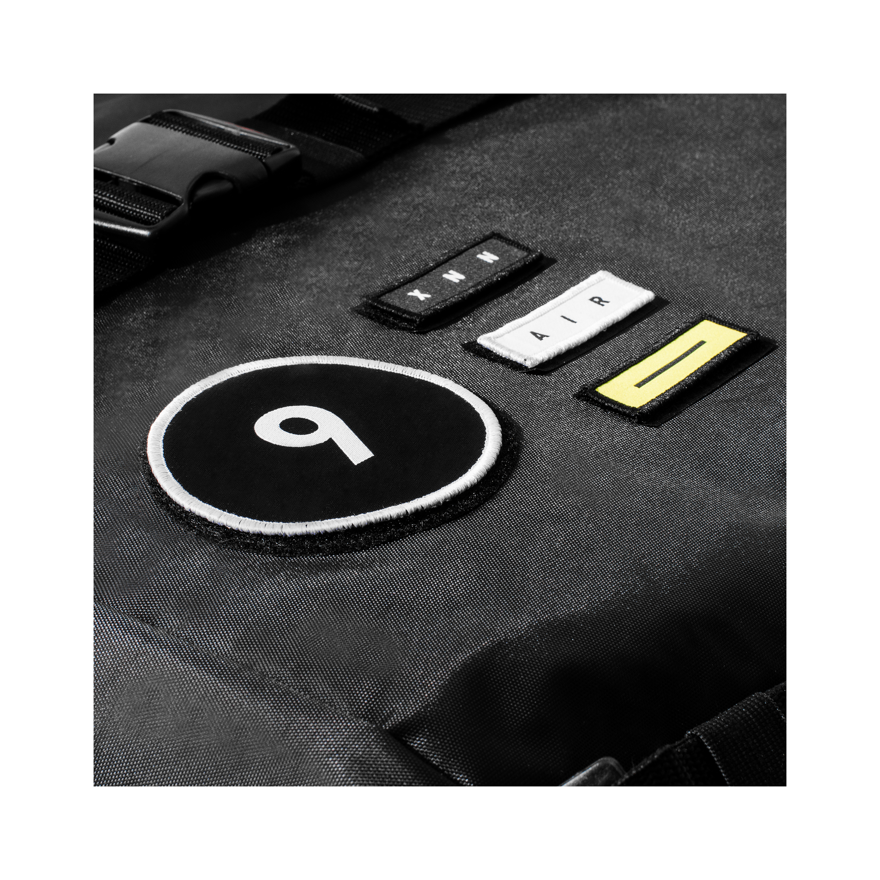
In the rapidly growing world of action sports, branding always played a huge role. Big logos visible from a mile away, often rendered in countless variations which evolve so often it’s impossible to keep up. Luckily the folks at Xenon trusted our vision which opted for more subtle, low-key branding. Probably not the best approach from a pure marketing standpoint, but from the very beginning our common goal was to establish a strong connection between the customer and brand aesthetics as a whole, not just a “cool” logo.
︎


︎
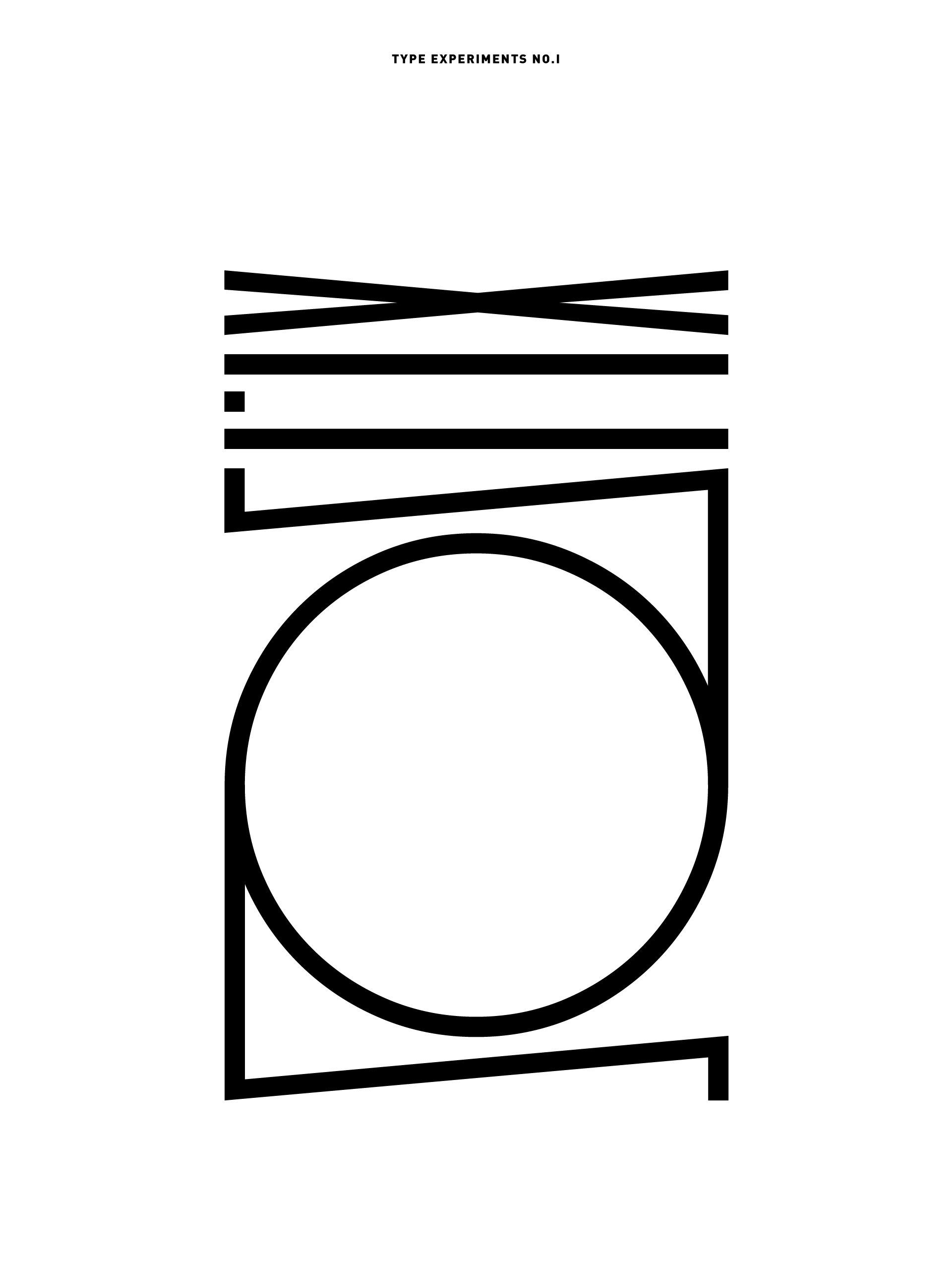
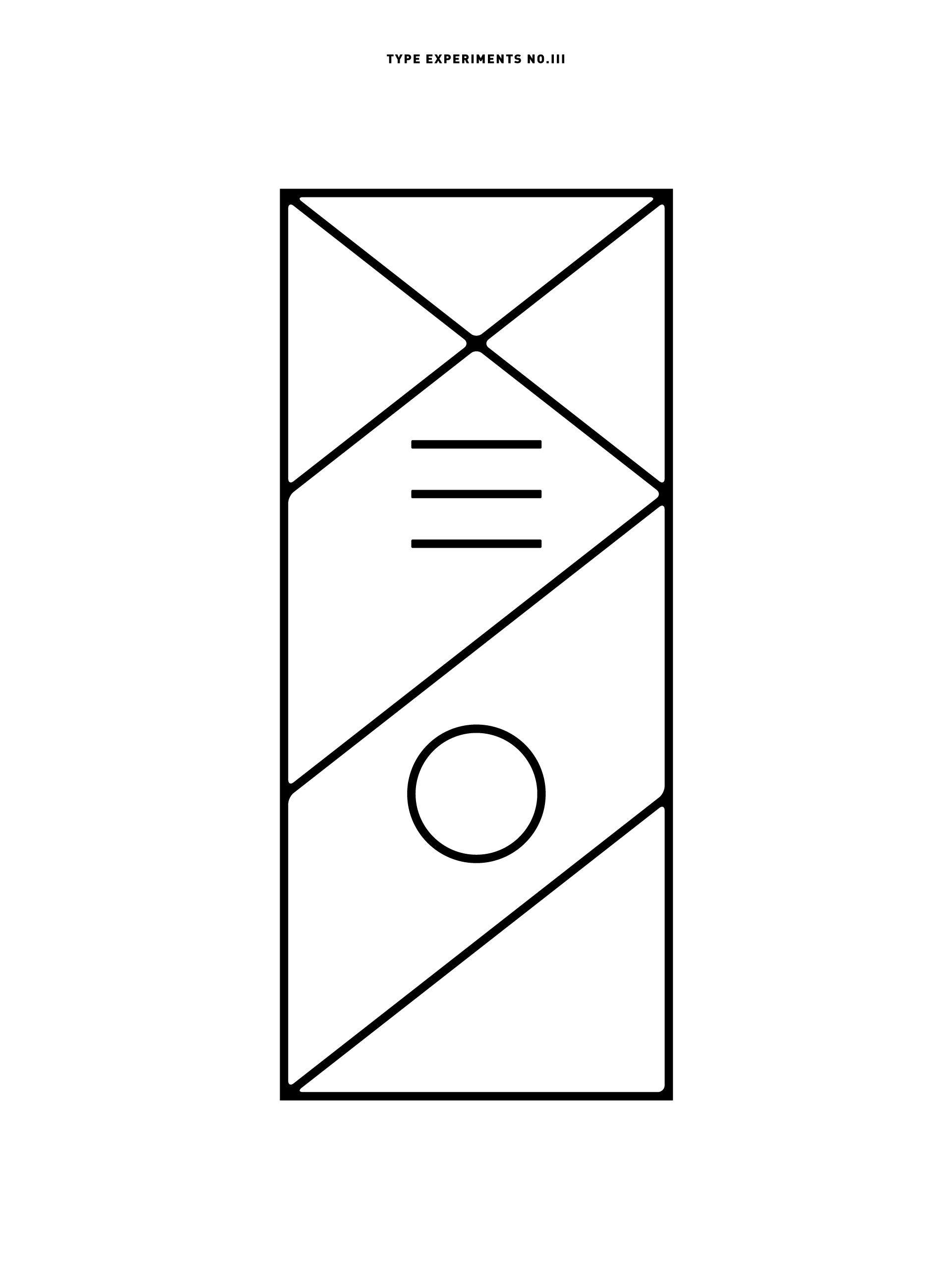
Polish Avant-garde art from the 1920/1930ies, abstract compositions, geometric forms, simple patterns, and constructivism were some of our main inspirations when creating Xenon’s visual language. Shown below are examples of abstract experiments with type, which often became a foundation for graphic designs implemented across various media such as boards, kites, and apparel.
︎


︎
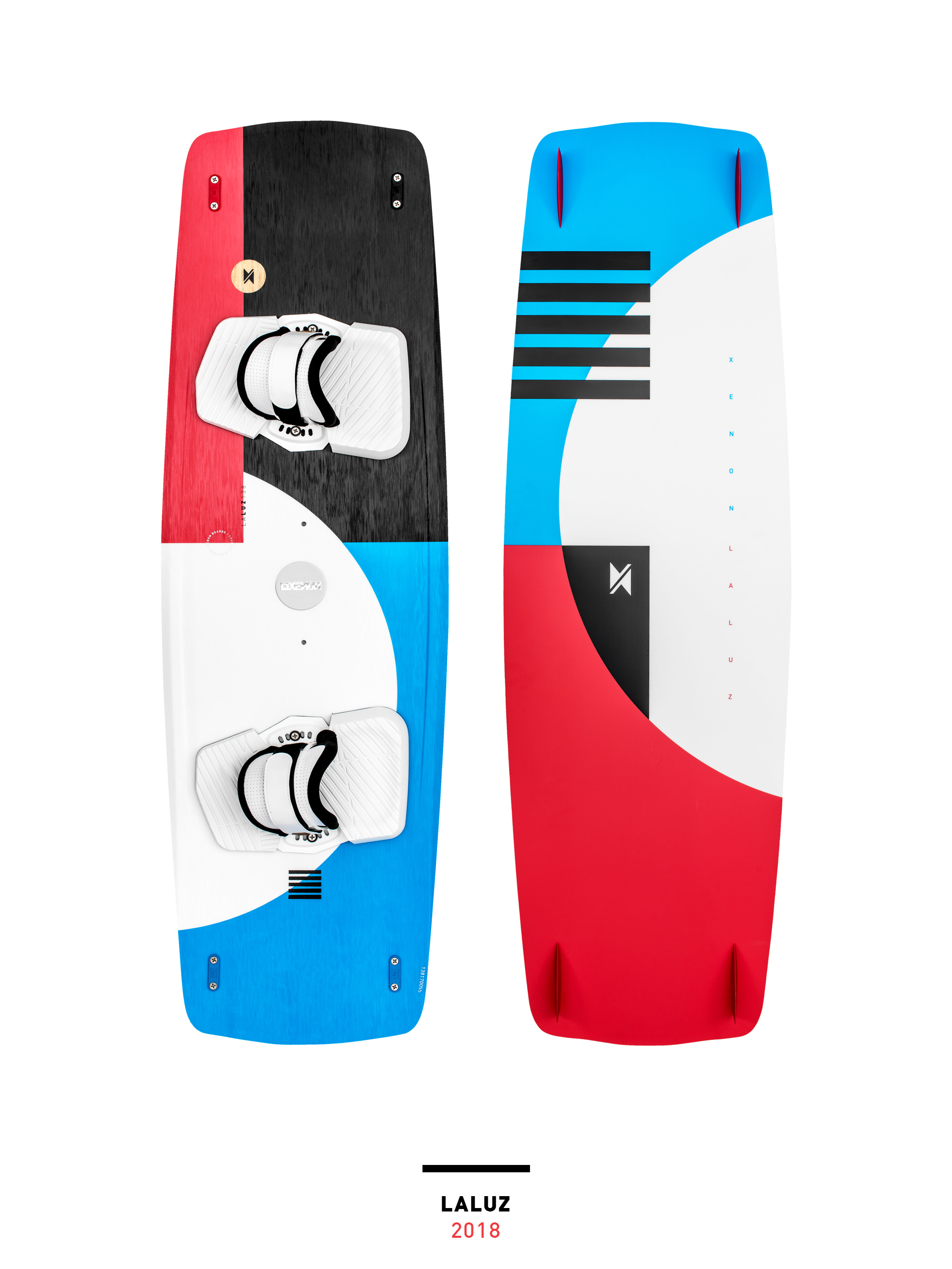
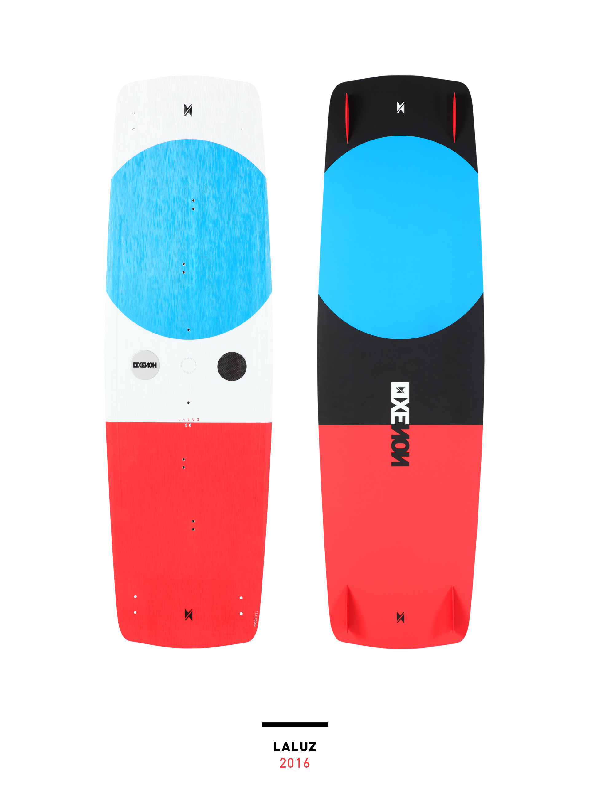
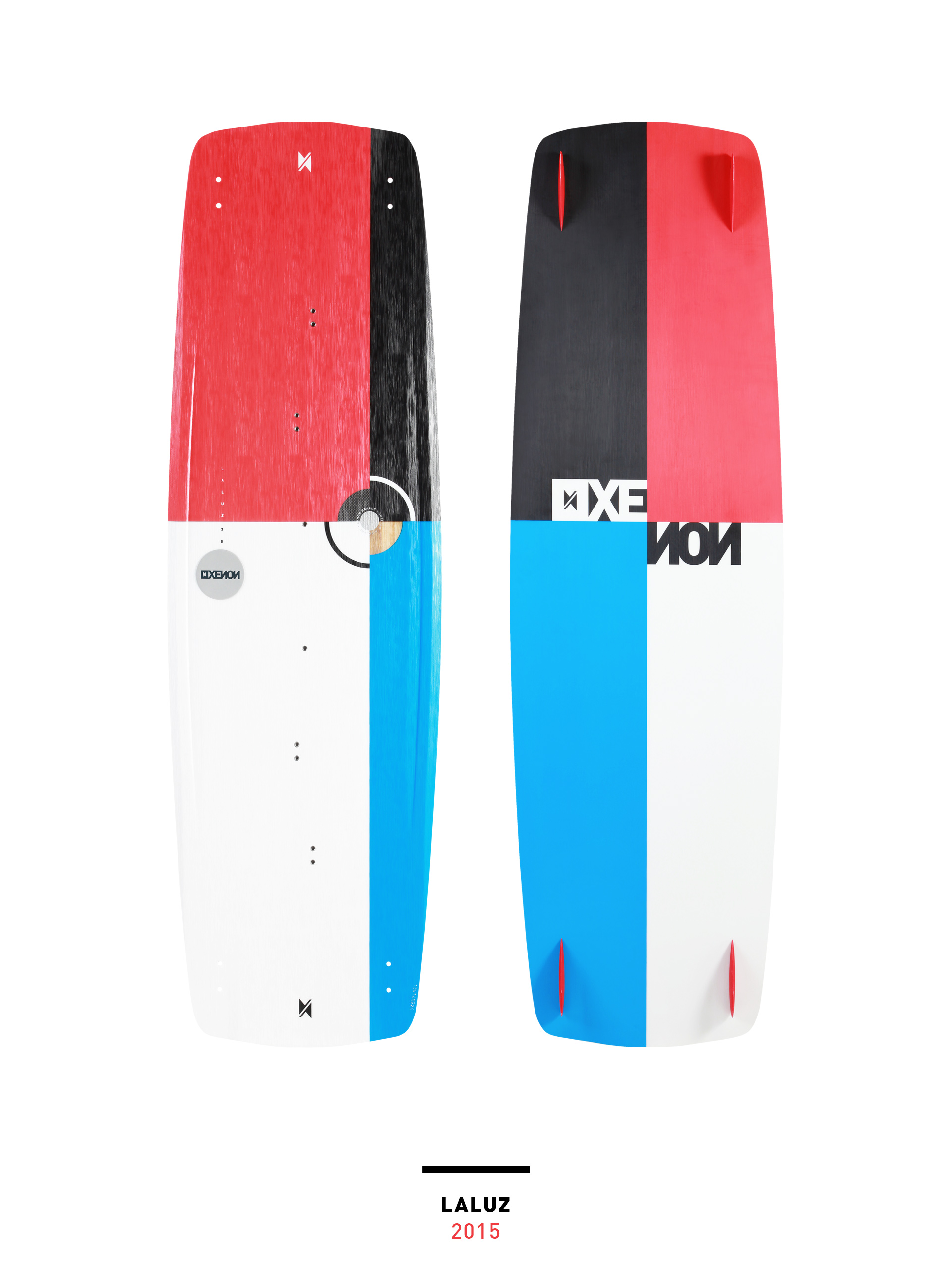
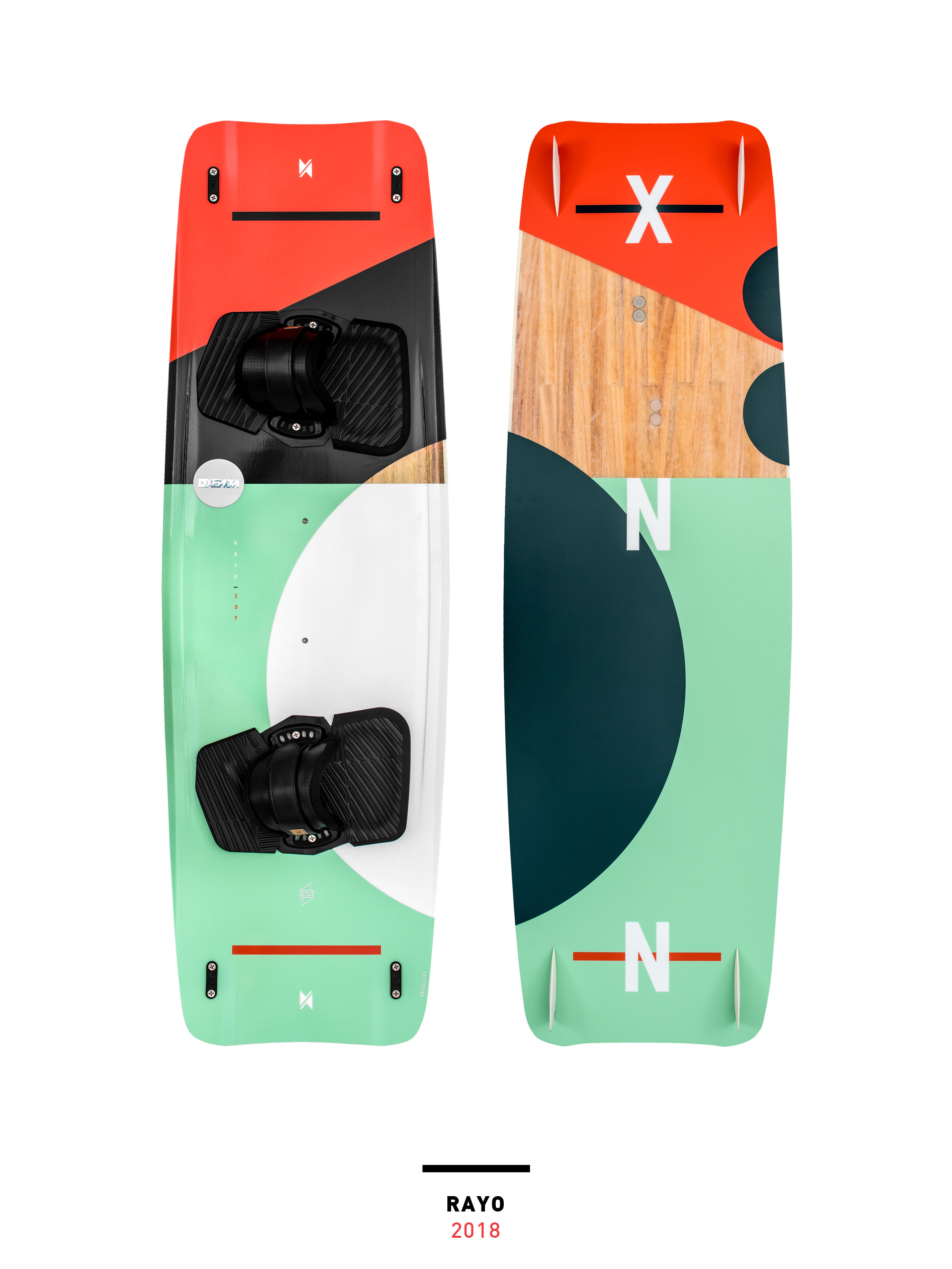
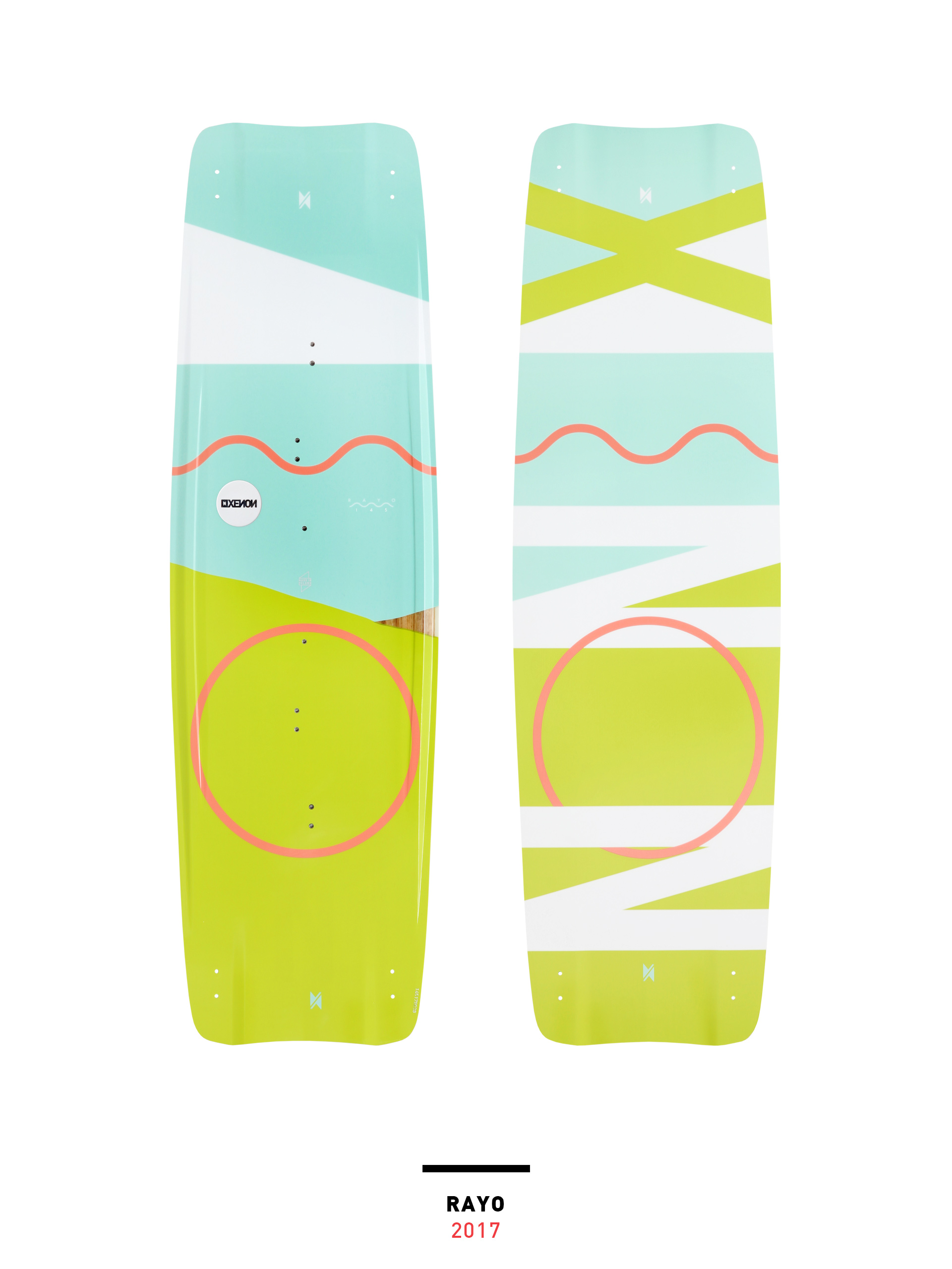
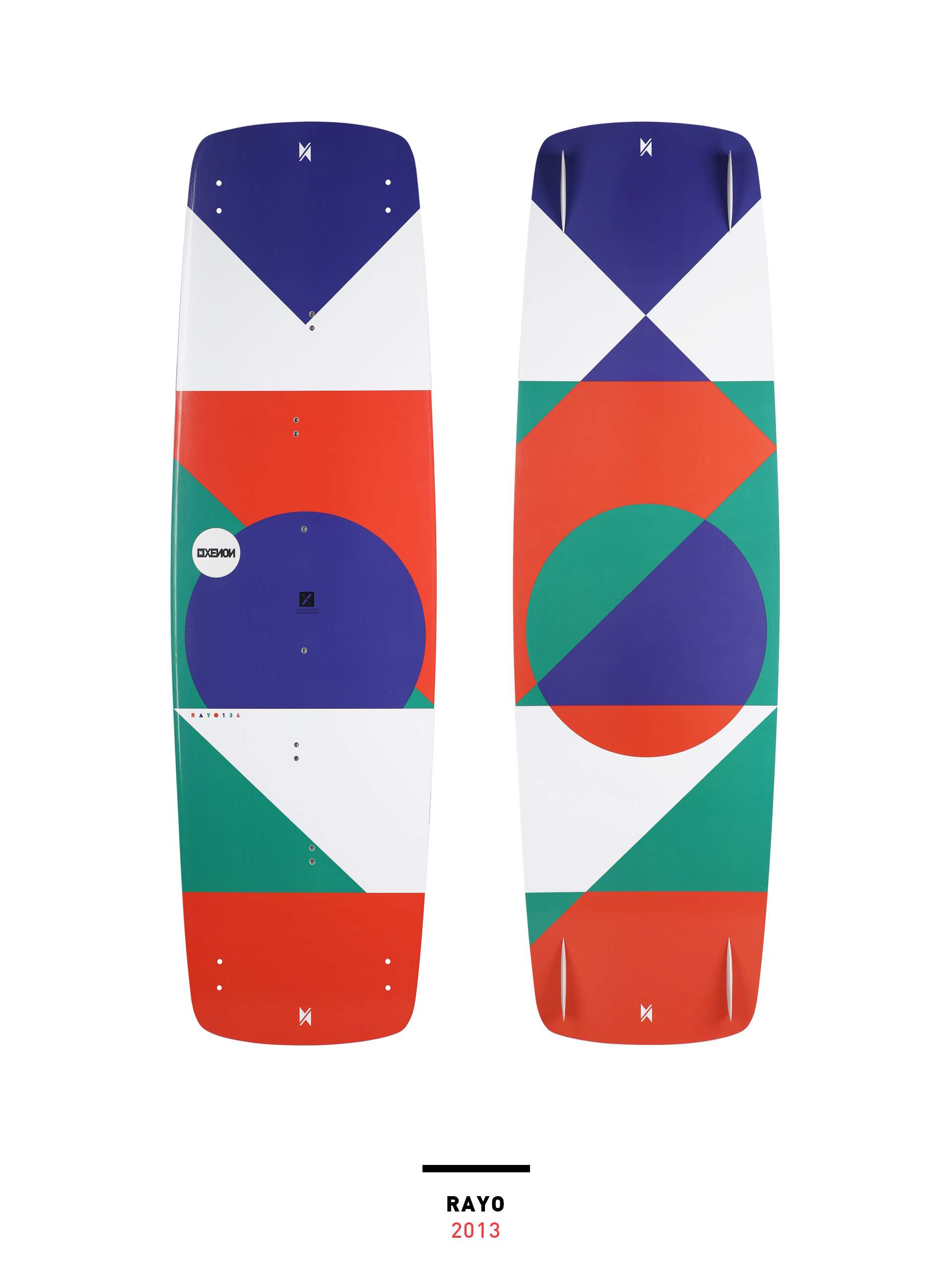
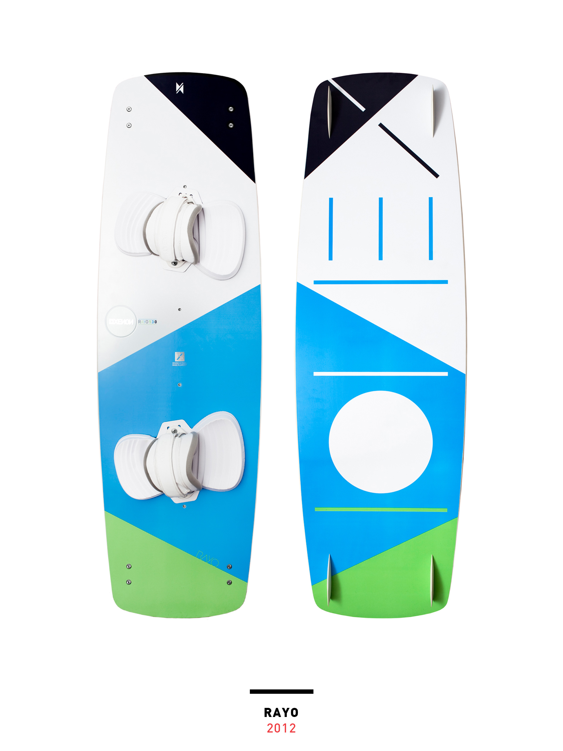
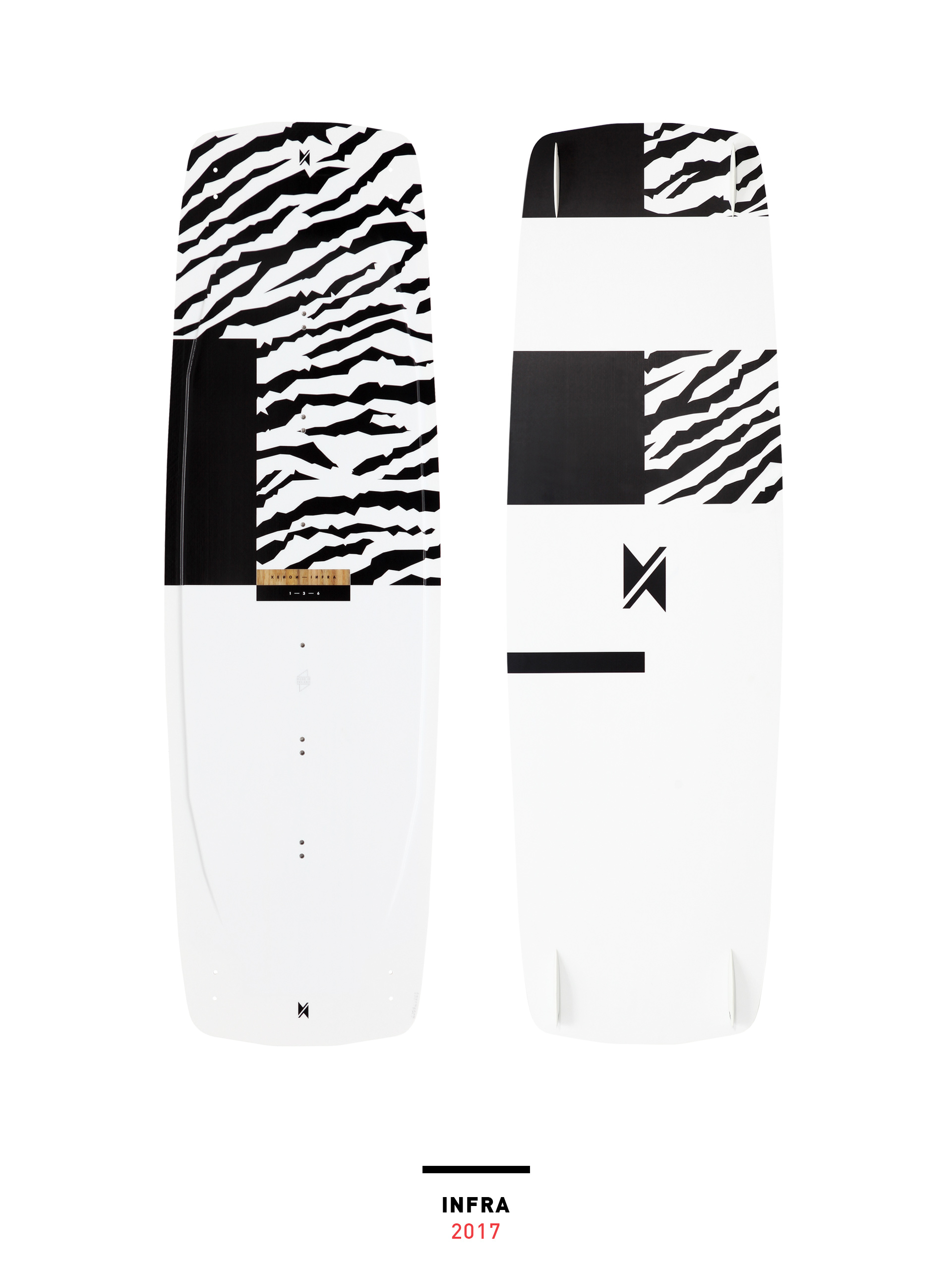
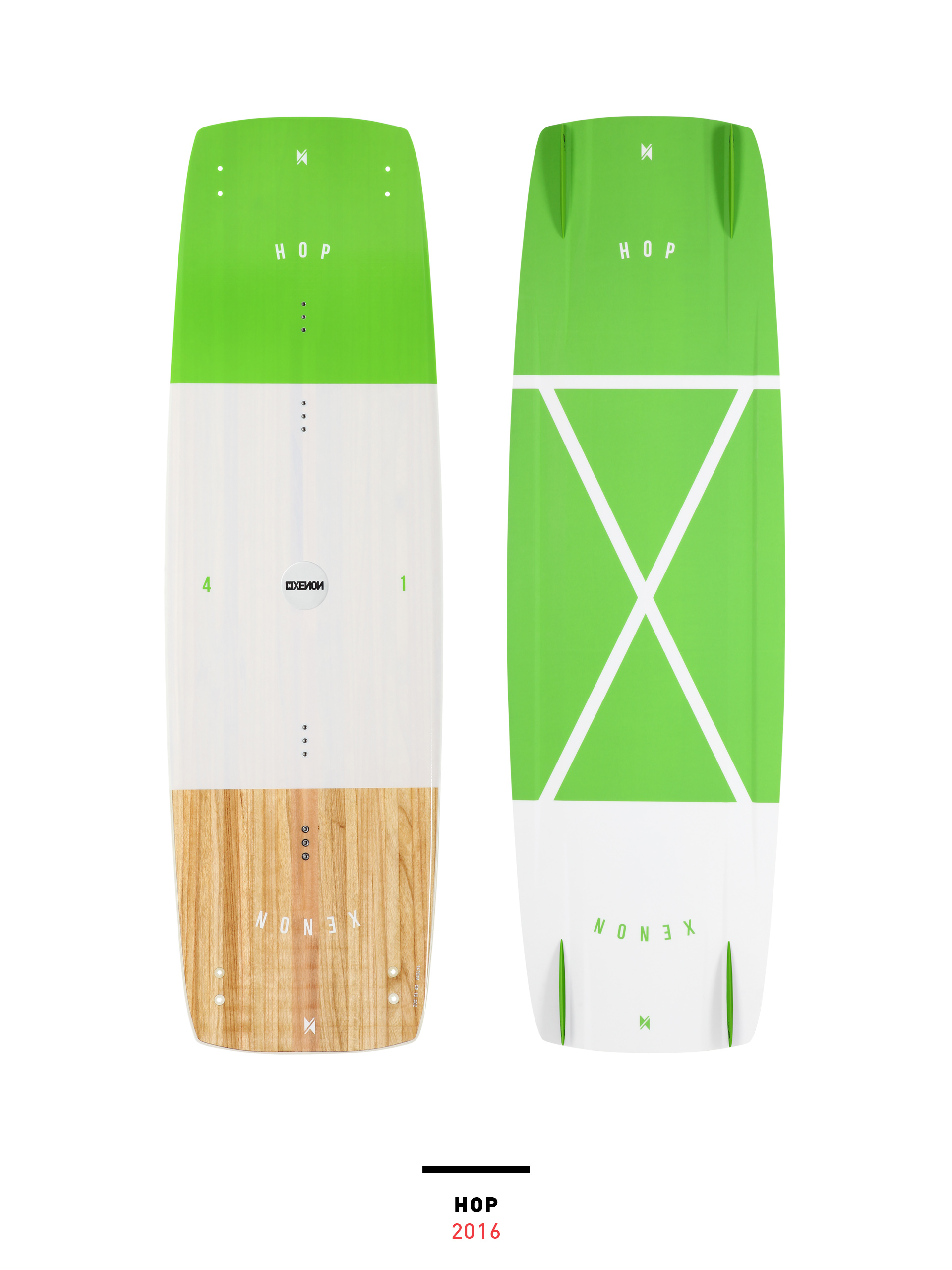
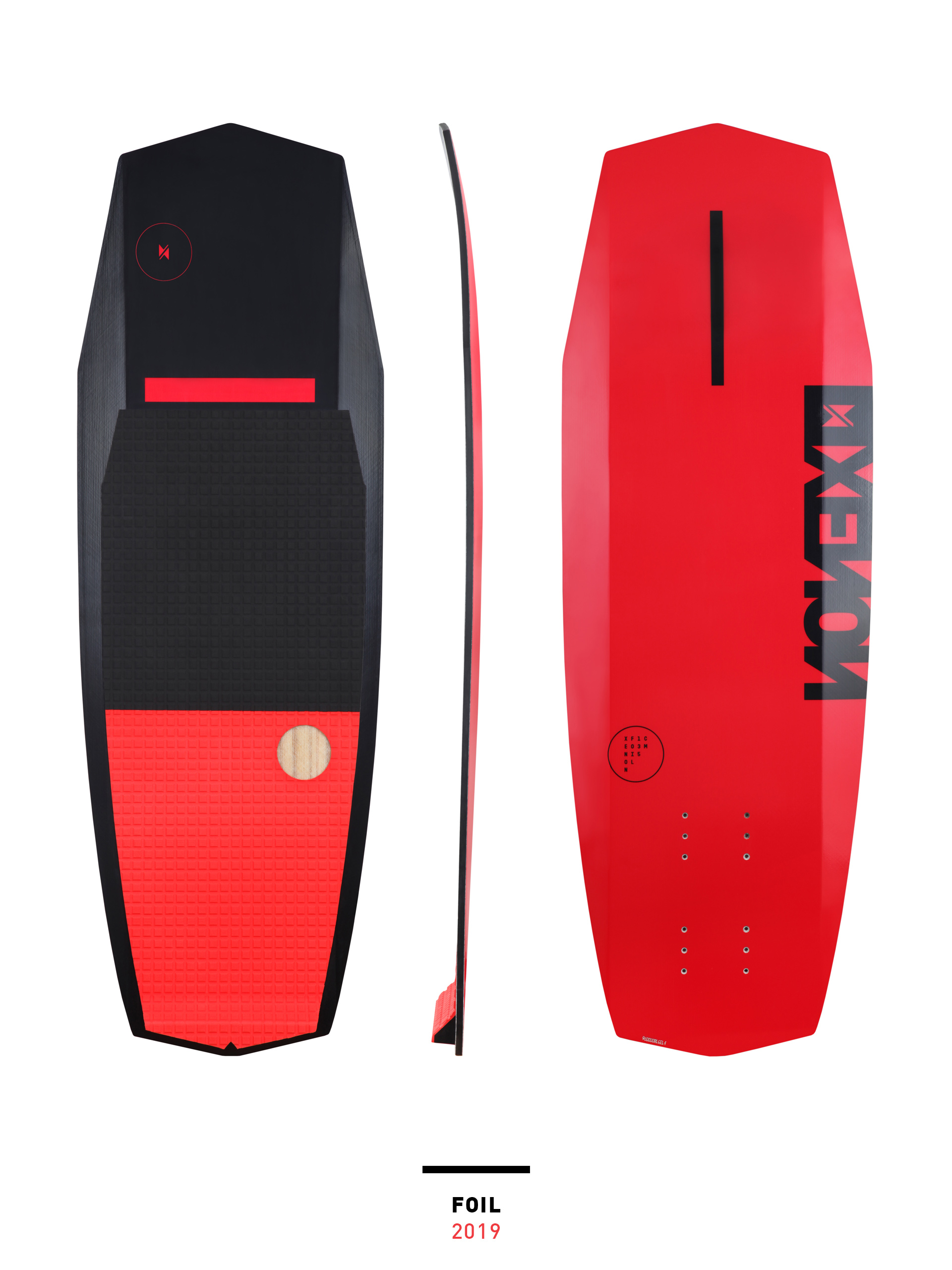
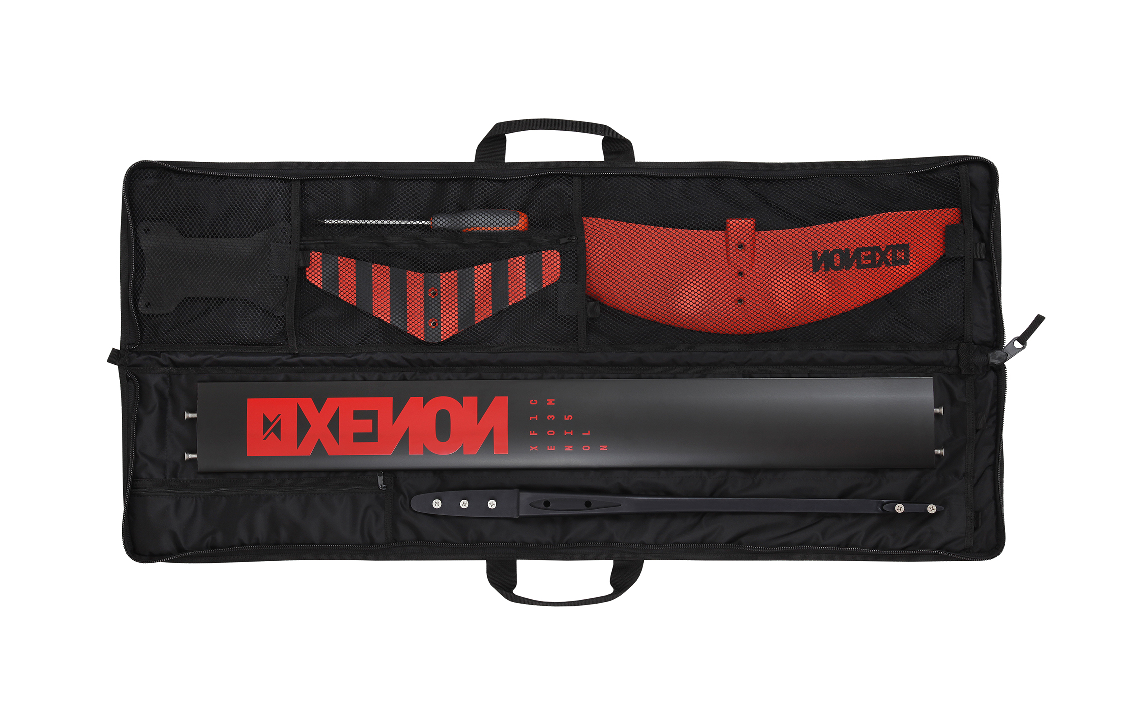
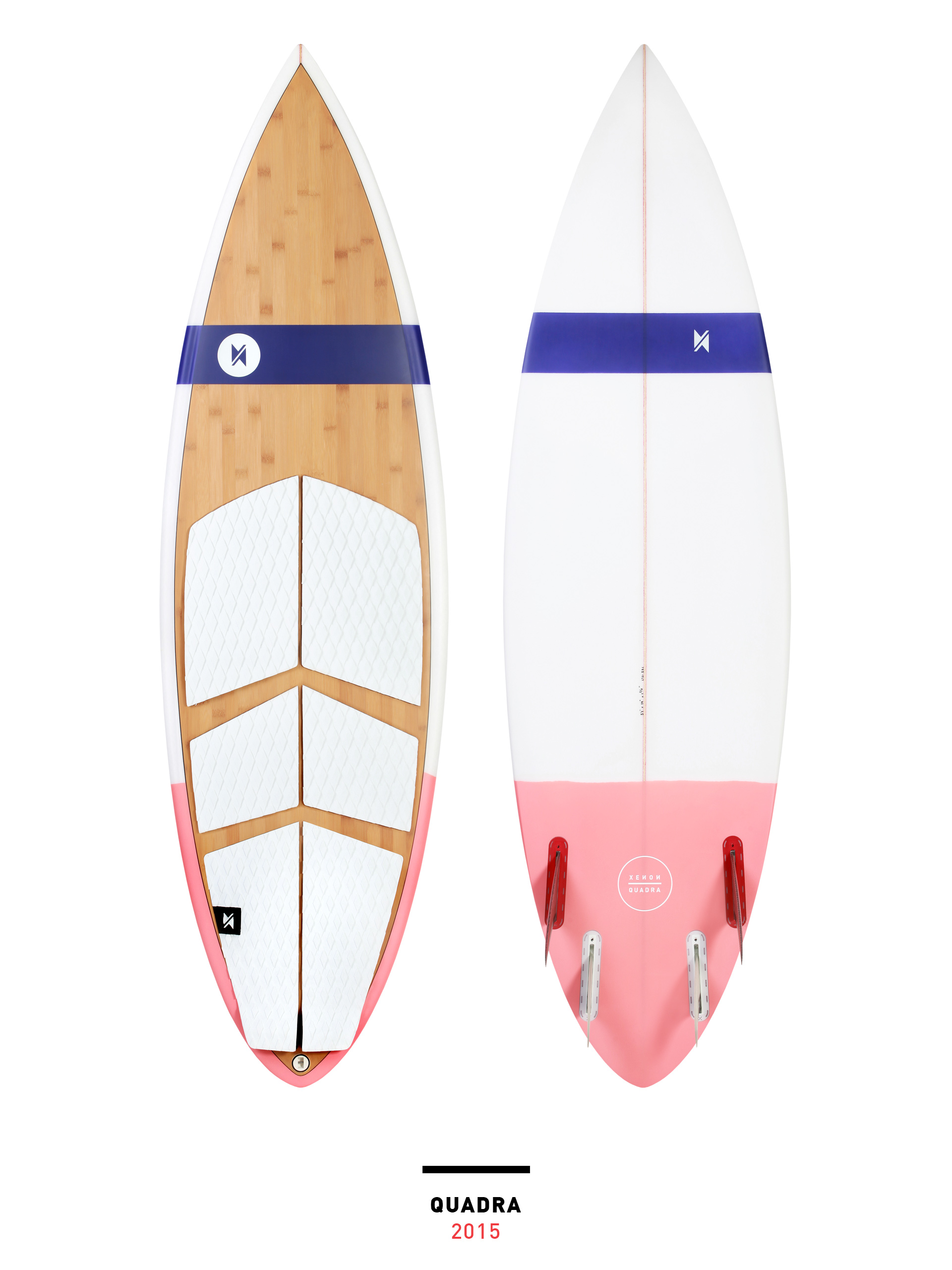
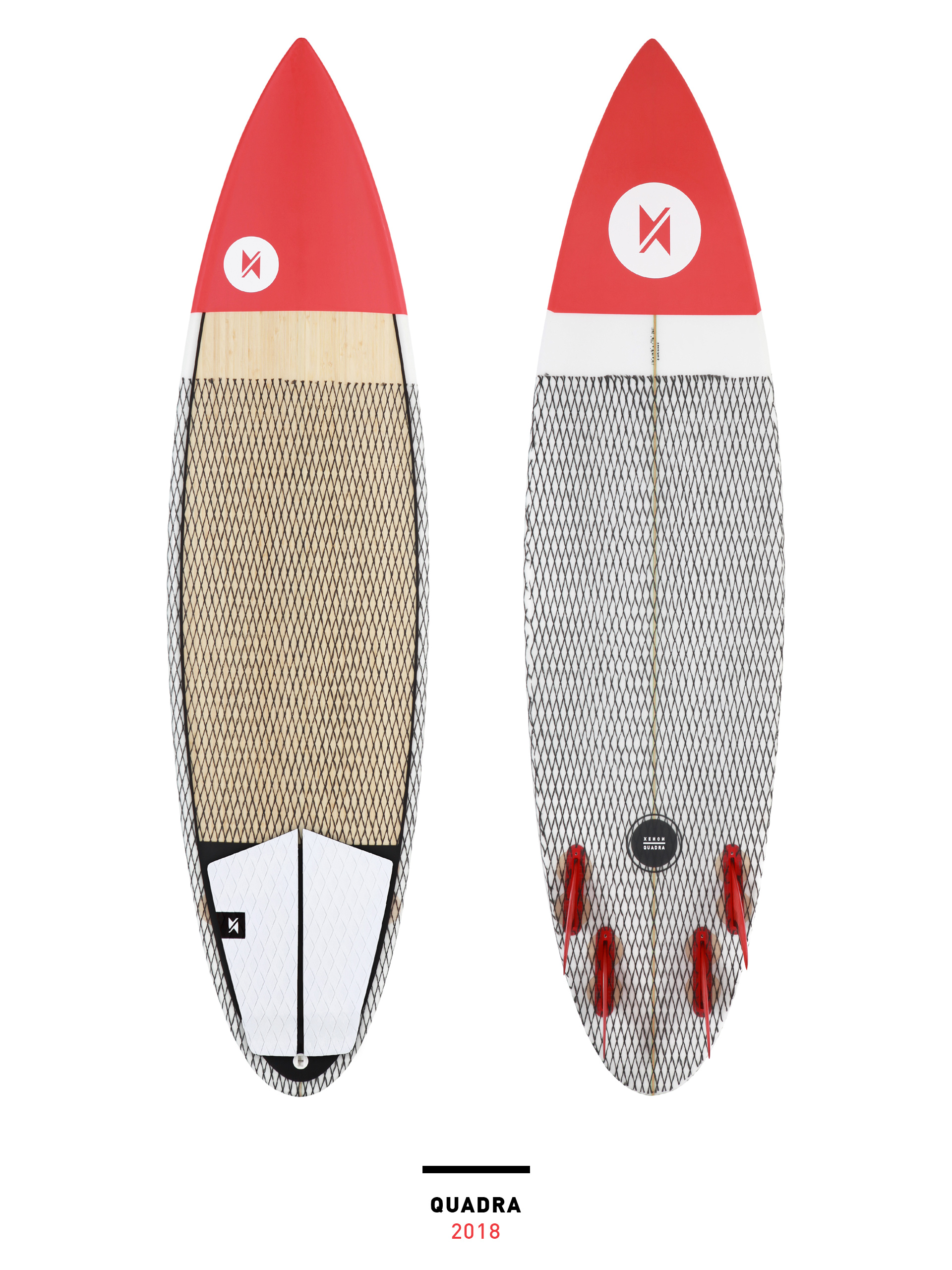
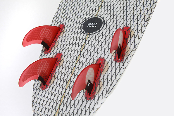
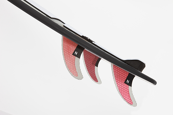
It has been a long and abundant cooperation with Xenon which resulted in numerous board graphics we had the pleasure of designing throughout the years. Below is just a small selection of some of our favorite shred planks.
︎


︎
How time flies! 2019 marked 10 years of the company’s active market presence. To celebrate this milestone we designed the ”Xnniversary Edit10n” LaLuz and Rayo - the very first two boards in Xenon’s 2009 quiver. From the begining they were everybody’s favorite boards, absolute bestsellers and a huge part of the brand’s success, so it seemed like a cool idea to release them in a special limited graphic layout.
︎
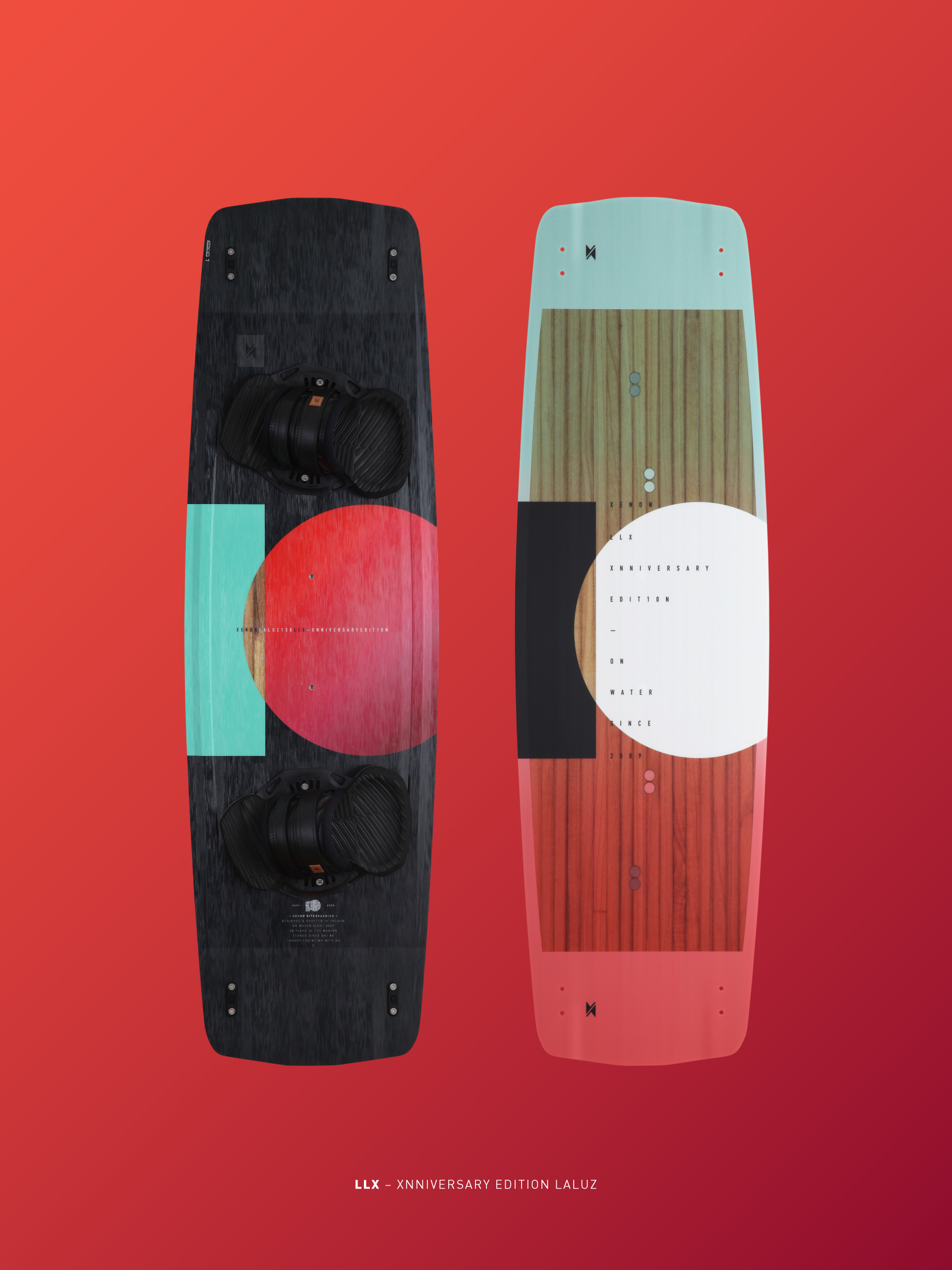
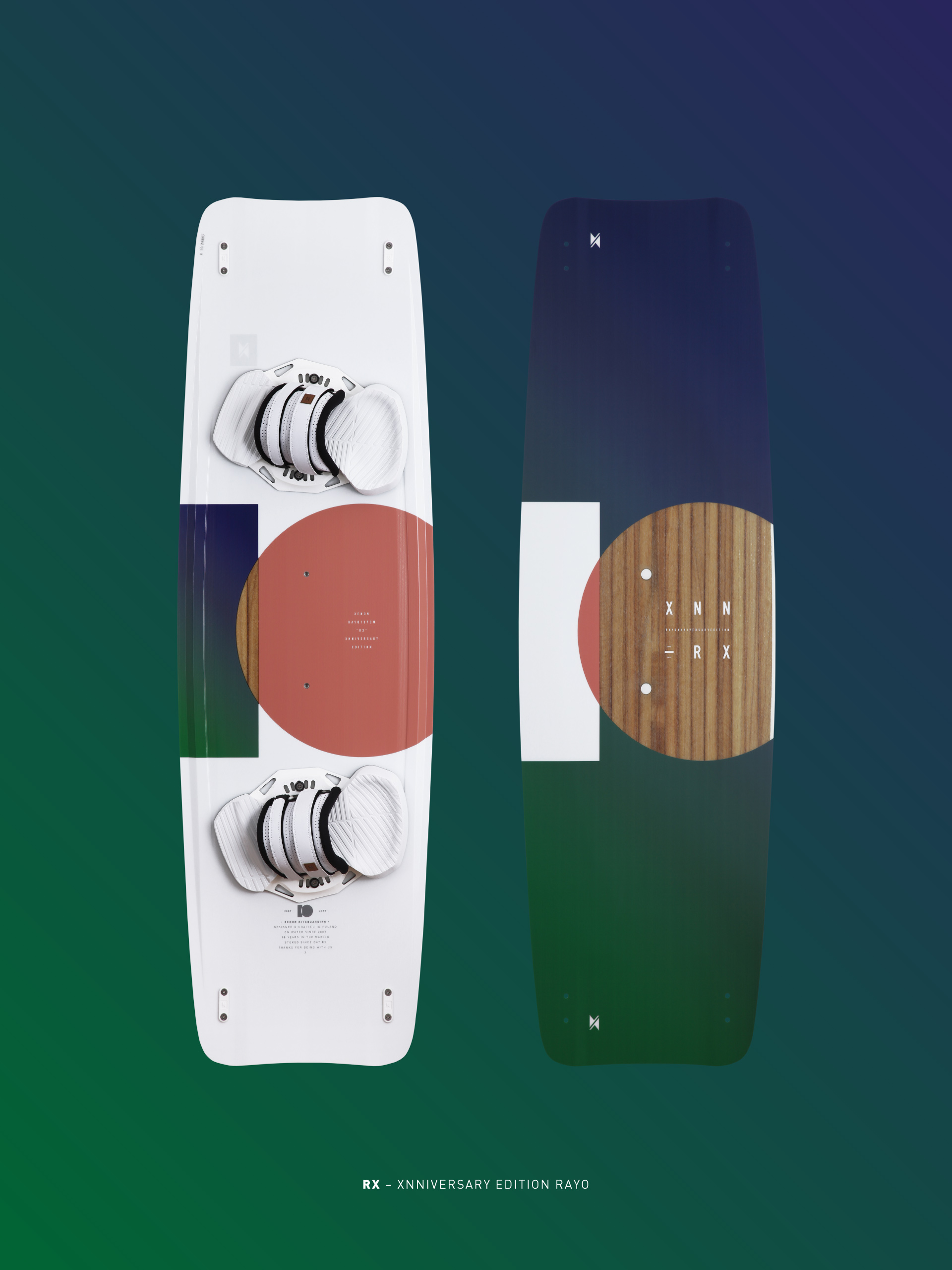


X N N I V E R S A R Y E D I T 1 0 N 2 0 0 9 — 2 0 1 9


︎
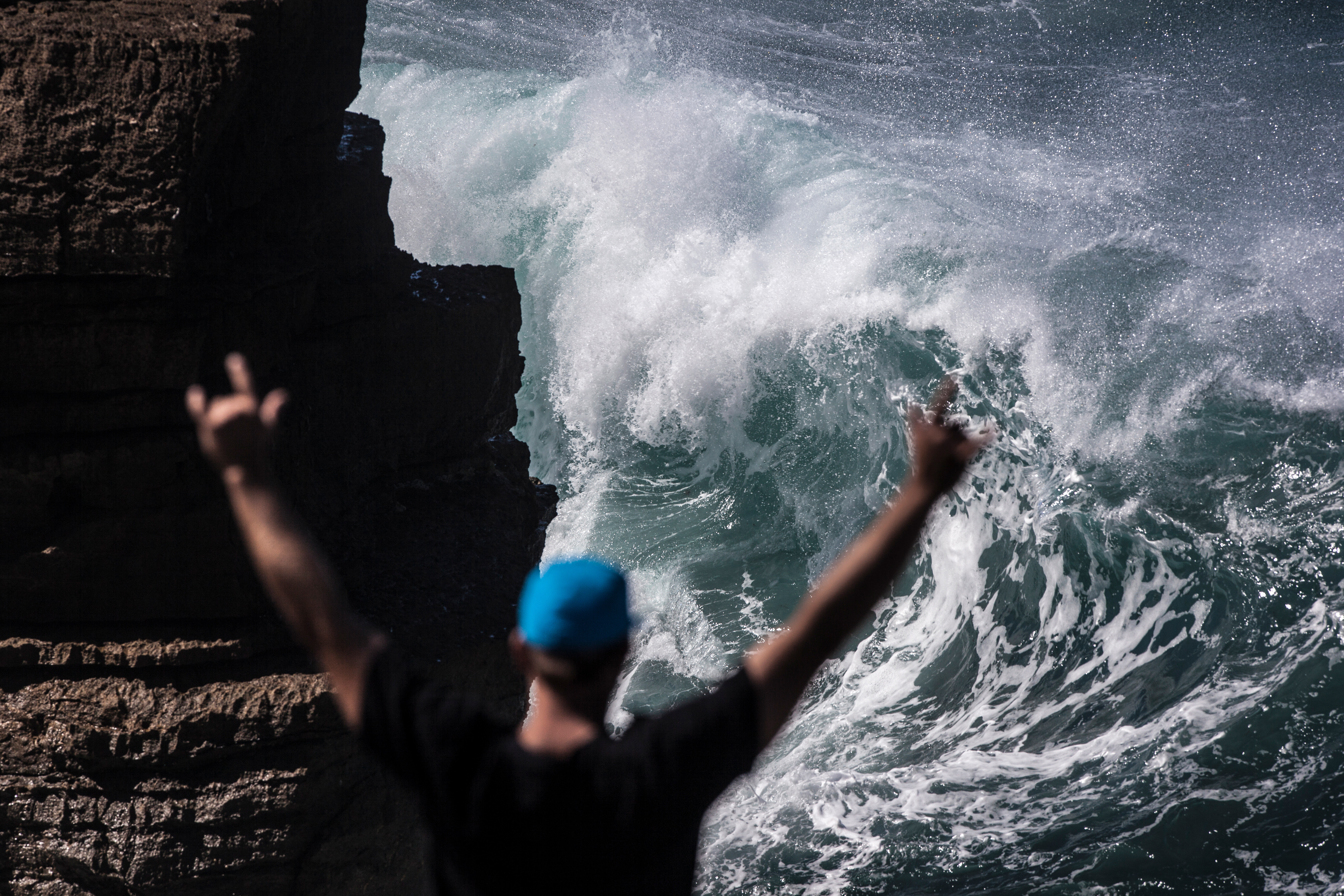
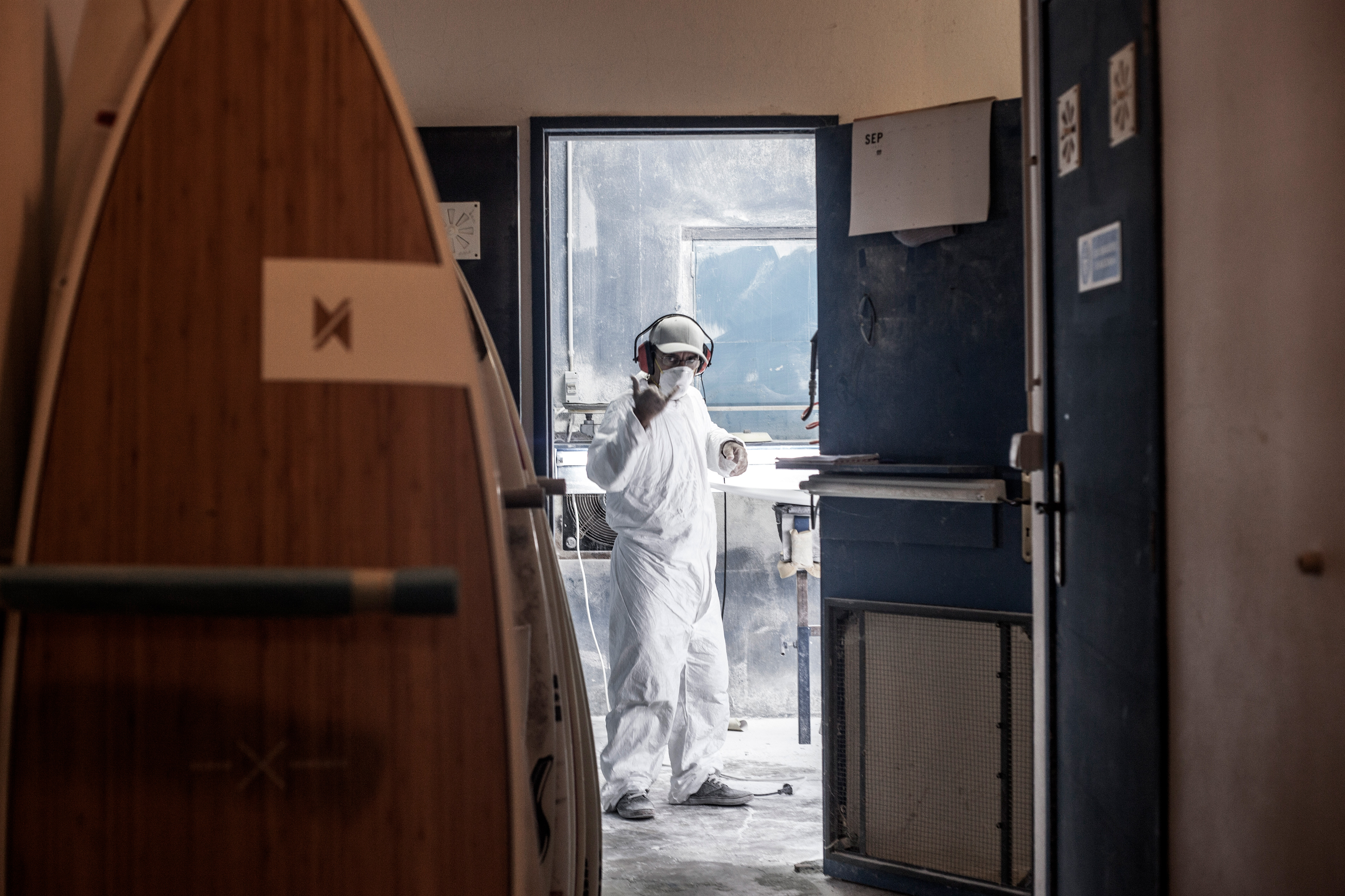
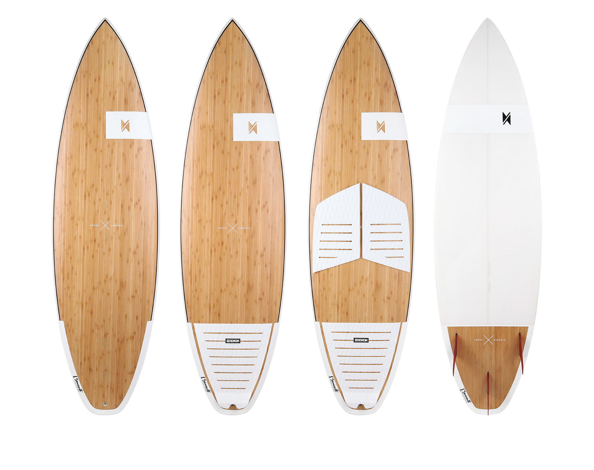
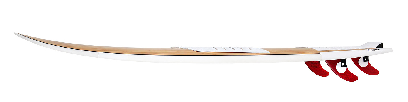
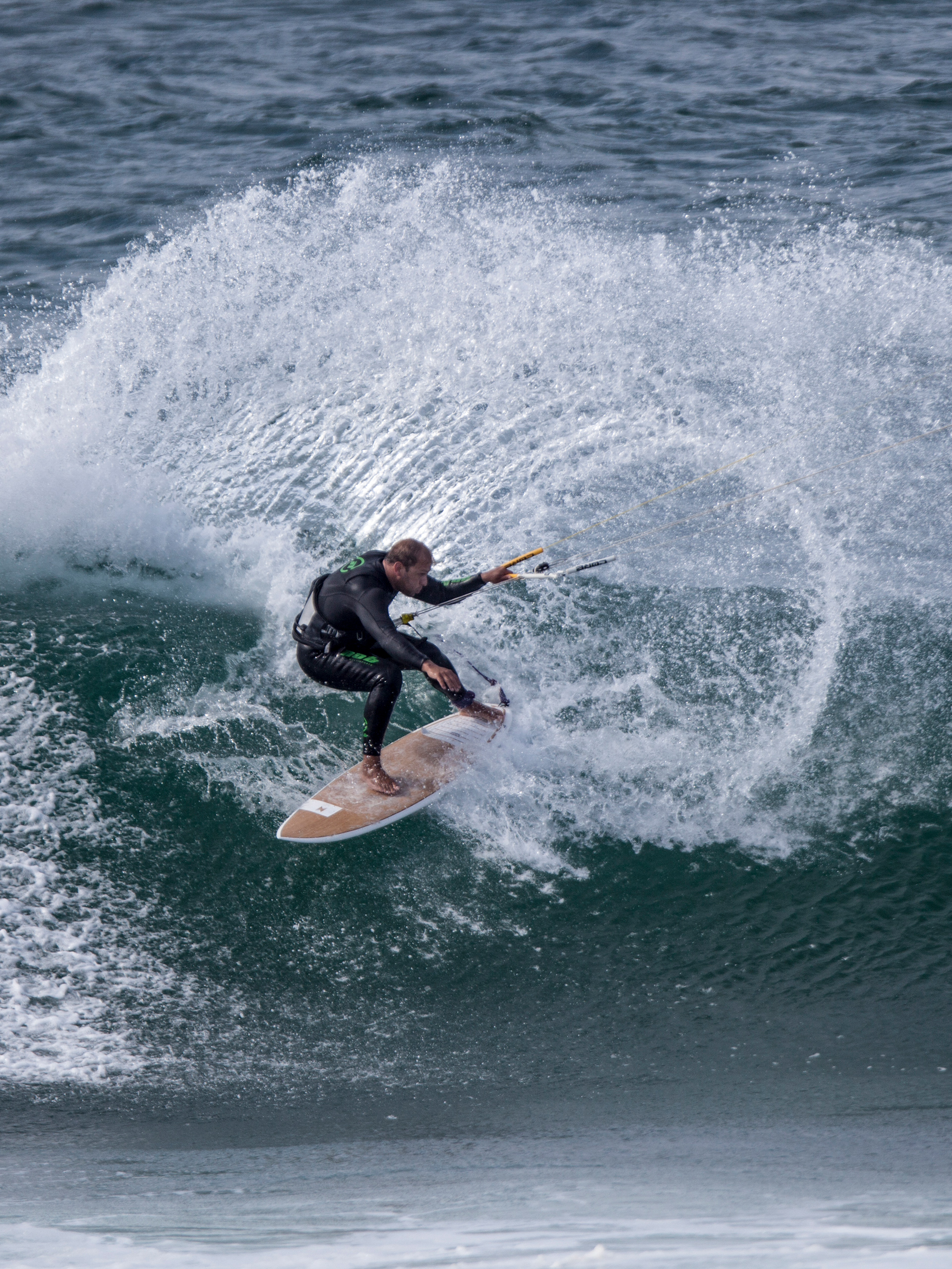
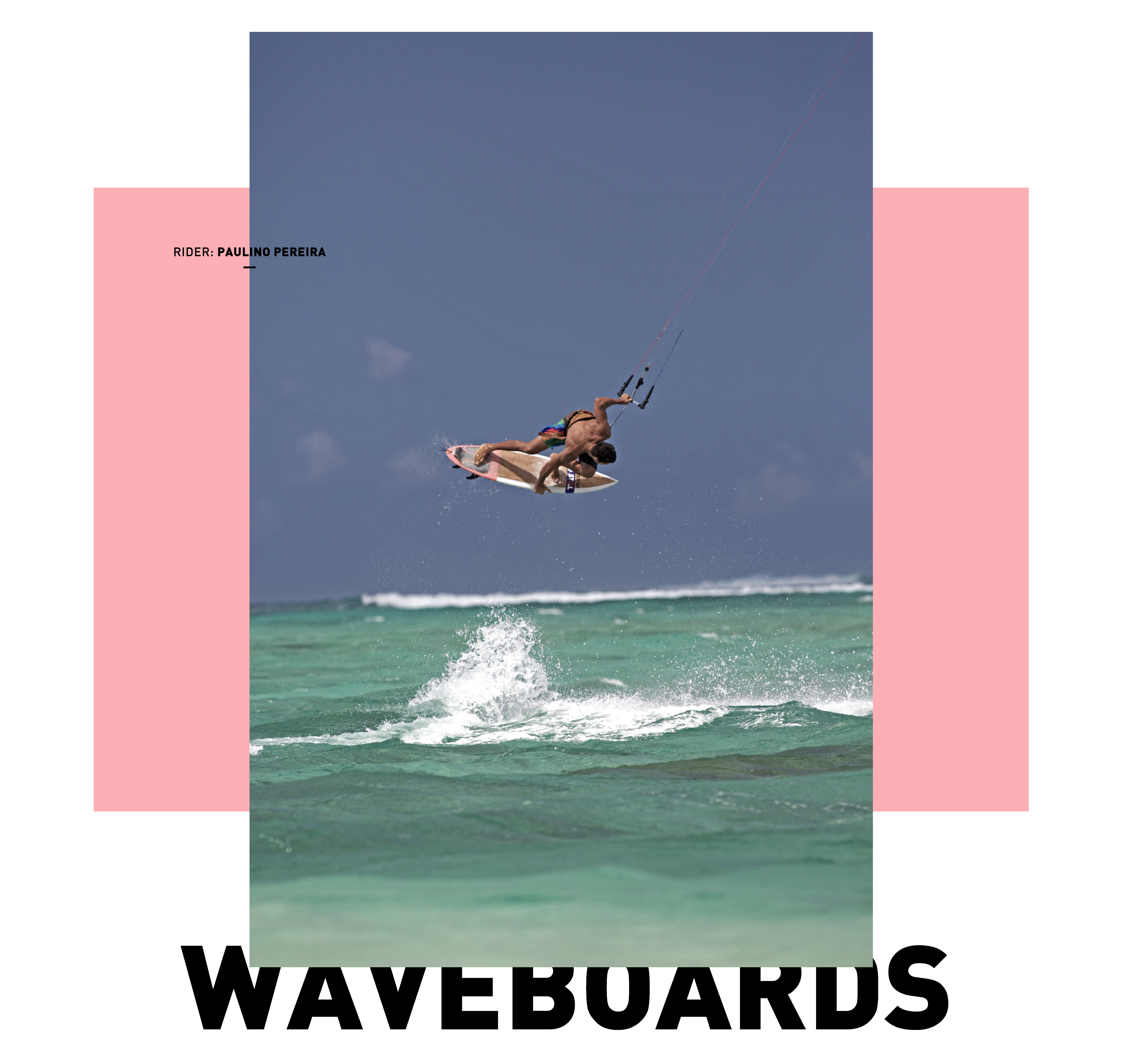
Primarily a brainchild of the guys at Xenon, this special board was developed in co-operation with legendary surfboard shaper Nick Uricchio from Semente Surfboards Portugal. The goal behind this project was to find a shape that would actually serve both kitesurfers and surfers and not only be a marketing stunt. A board that would work as a full-time kiteboard on windy days, or a snappy surfboard if the waves build up. For the geeks: it comes in 6'0 x 20 1/8 2 x 7/16 and 33L of volume. This collaboration is special to us because it exemplifies the brand philosophy of thinking outside the box. We also got to travel to Portugal, catch some waves, visit the Semente Surfboards facility, and grab a long, inspiring lunch with Nick Uricchio himself.
︎