Project:
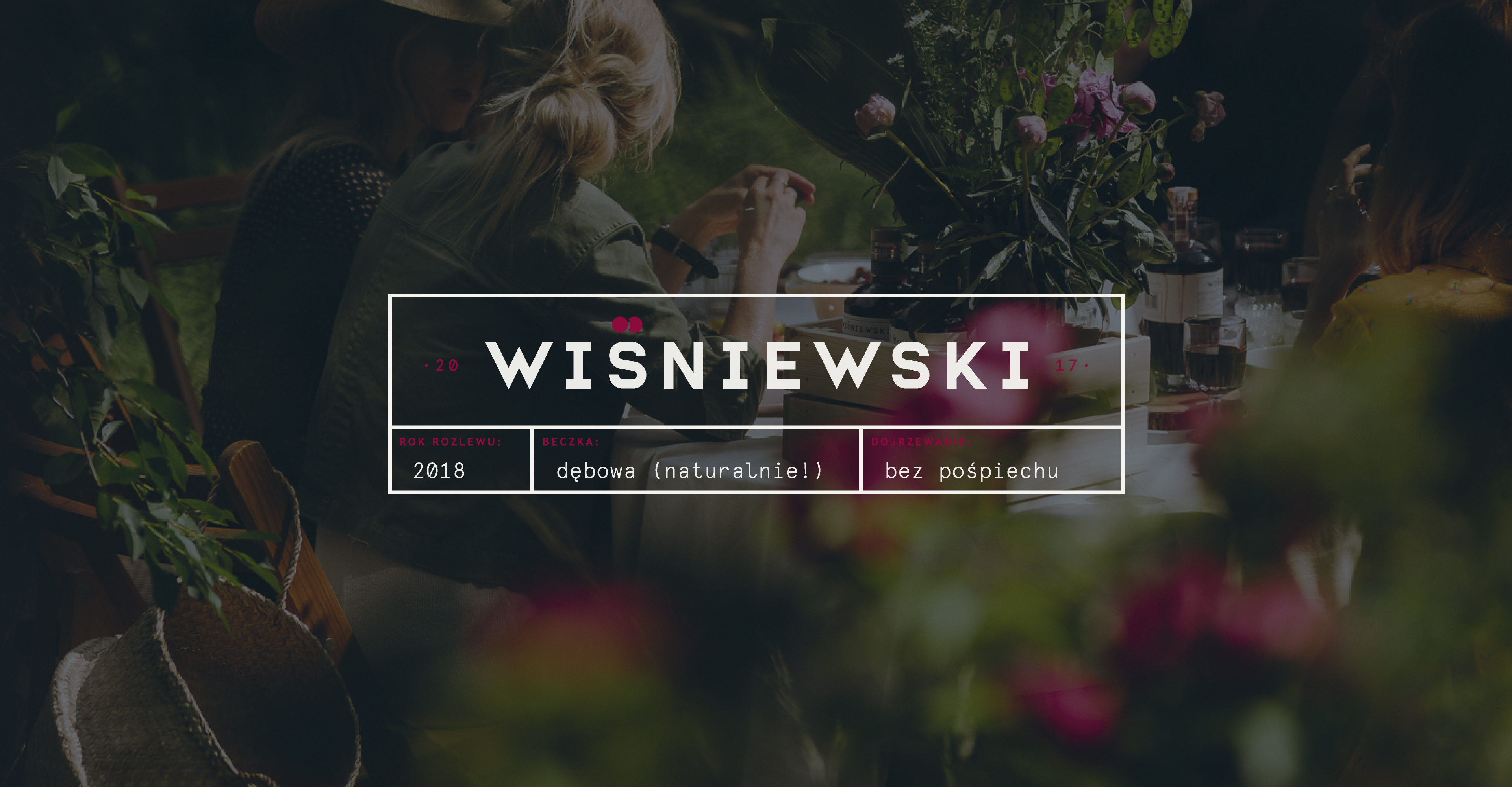
Wišniewski
(2018)
Client : WTK Sp. z o.o.
Market : Polish
Status : implemented
Scope : naming | identity | interior |
Co-author : Rafał Kaletowski
Strategy : Marta Fijał | Maciej Czarnecki |
︎: Pion Studio
︎: wisniewski.ltd
A
A cherry cordial brand which encourages to cherish the simple things in life.
Na zdrowie! – this common polish toast literally translates to “for health”. In the past alcohol was believed to have healing properties, especially cordials which were produced on-site in apothecaries and prescribed to invigorate one’s heart, body, and spirit. This ‘old truth’ became the foundation for our concept, when we were commissioned to design an entire identity from scratch, for a new brand of cherry cordial which slowly matures in oak barrels with whole cherries. The secret is in the stones!
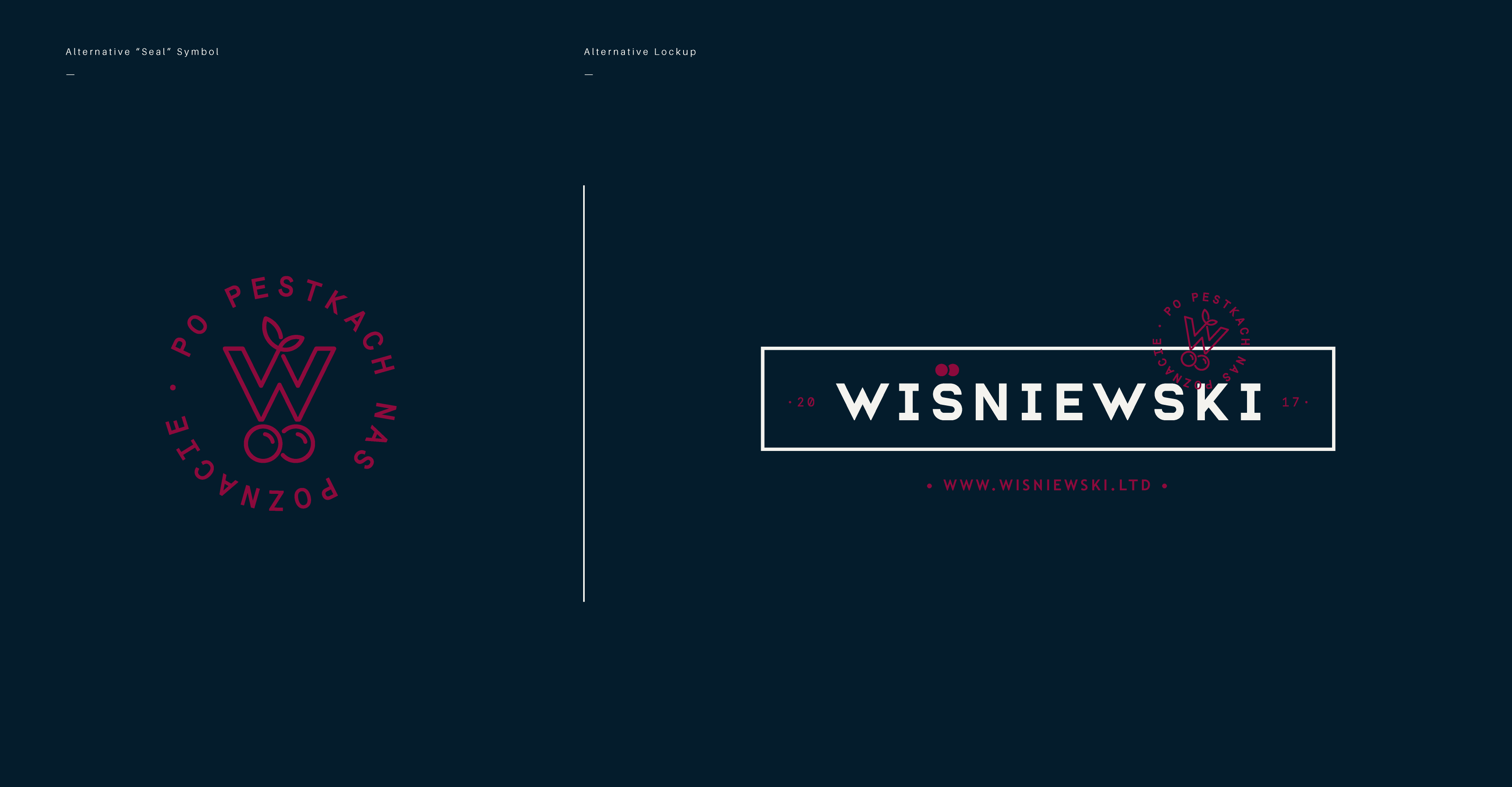
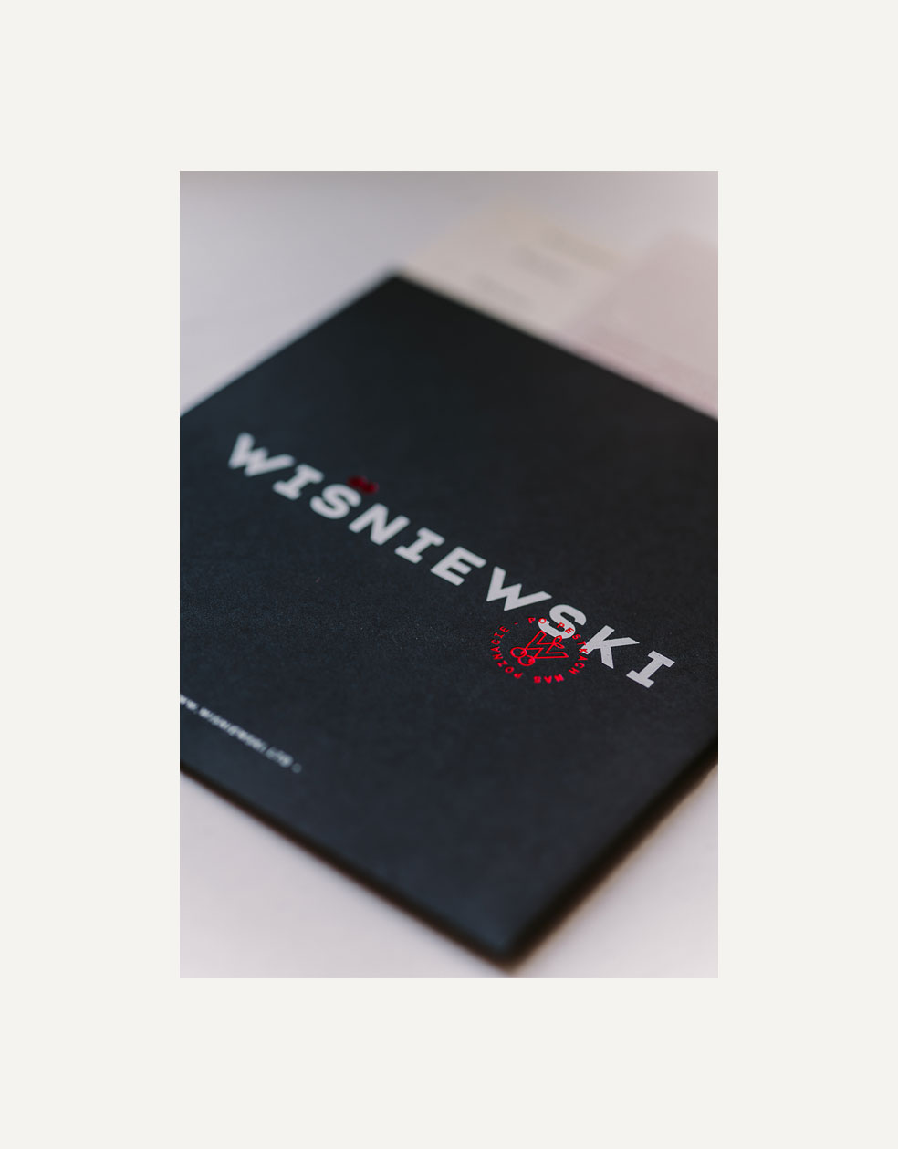
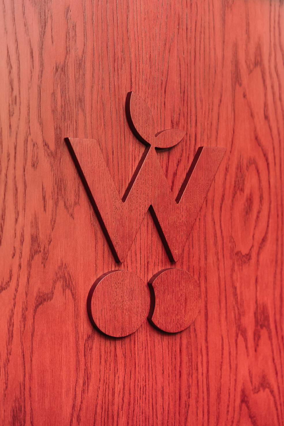
Wiśniewski – the brand name is a combination of one of the most popular Polish surnames (Kowalski) and the word ‘wiśnia’ (cherry). This gave the brand human features and helped shorten the distance between the consumer and the brand.
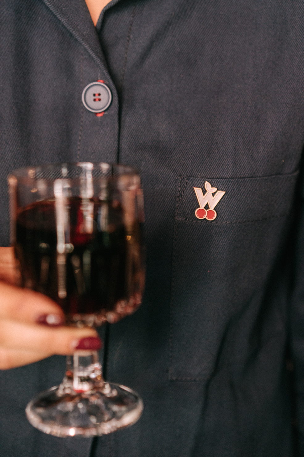
Open, honest, sociable - basic character traits of Wiśniewski, who was designed as a democratic brand for everyone, regardless of age, gender, or beliefs.
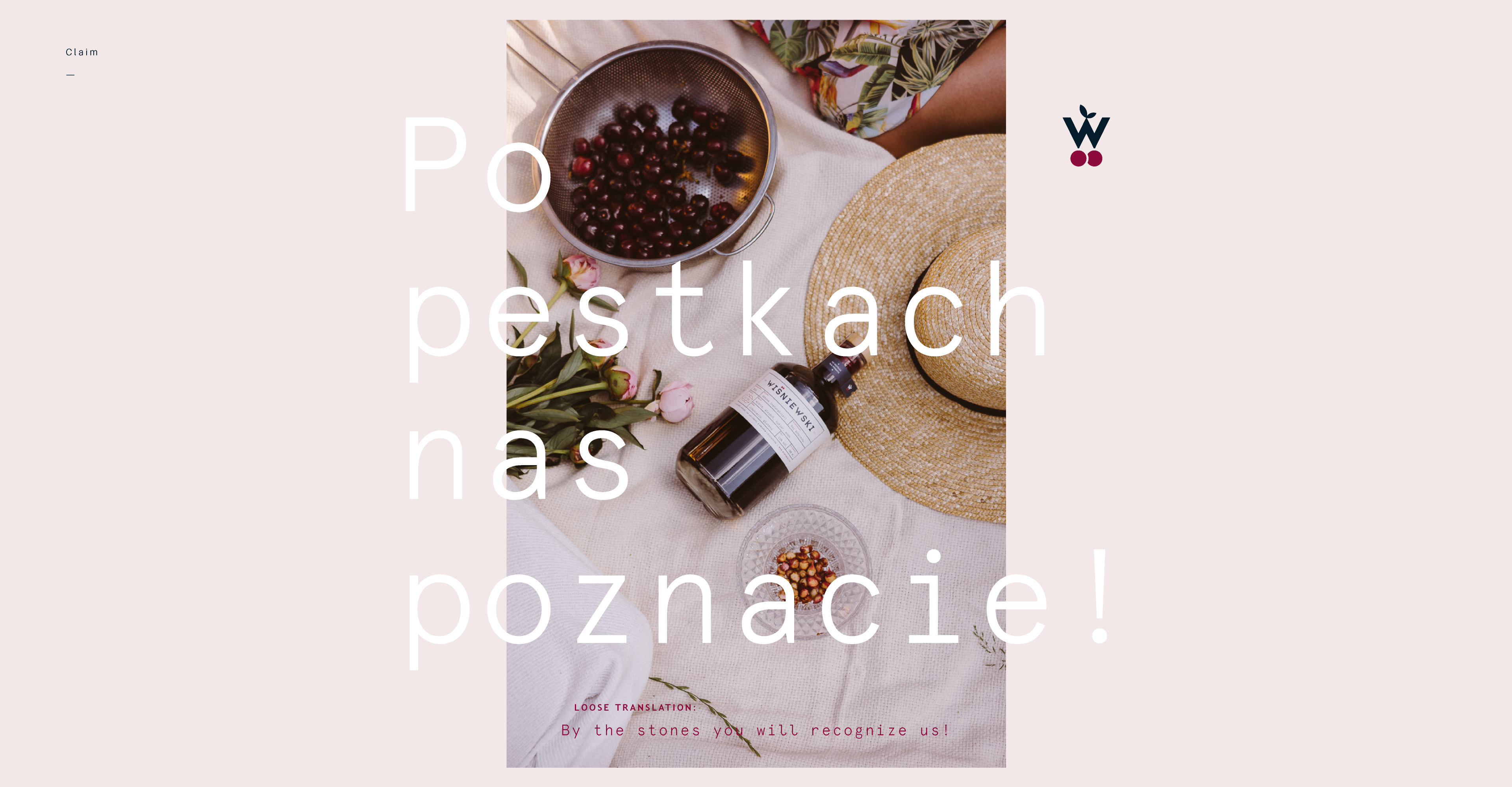
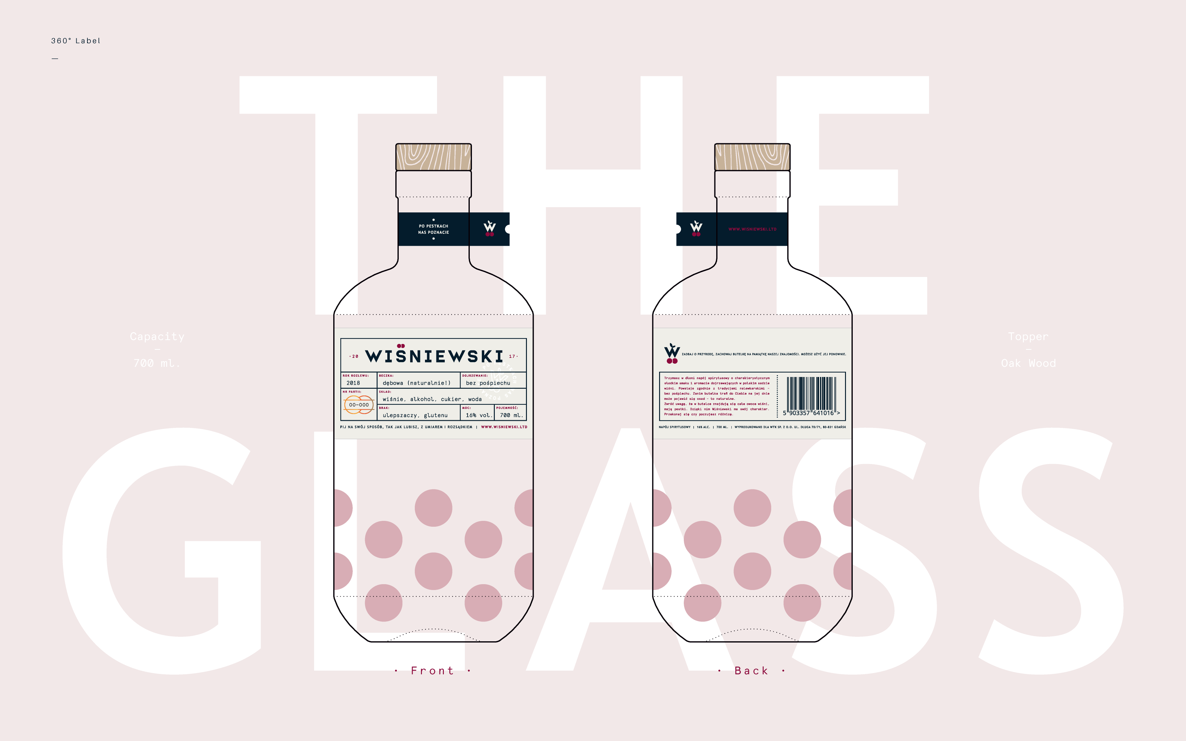
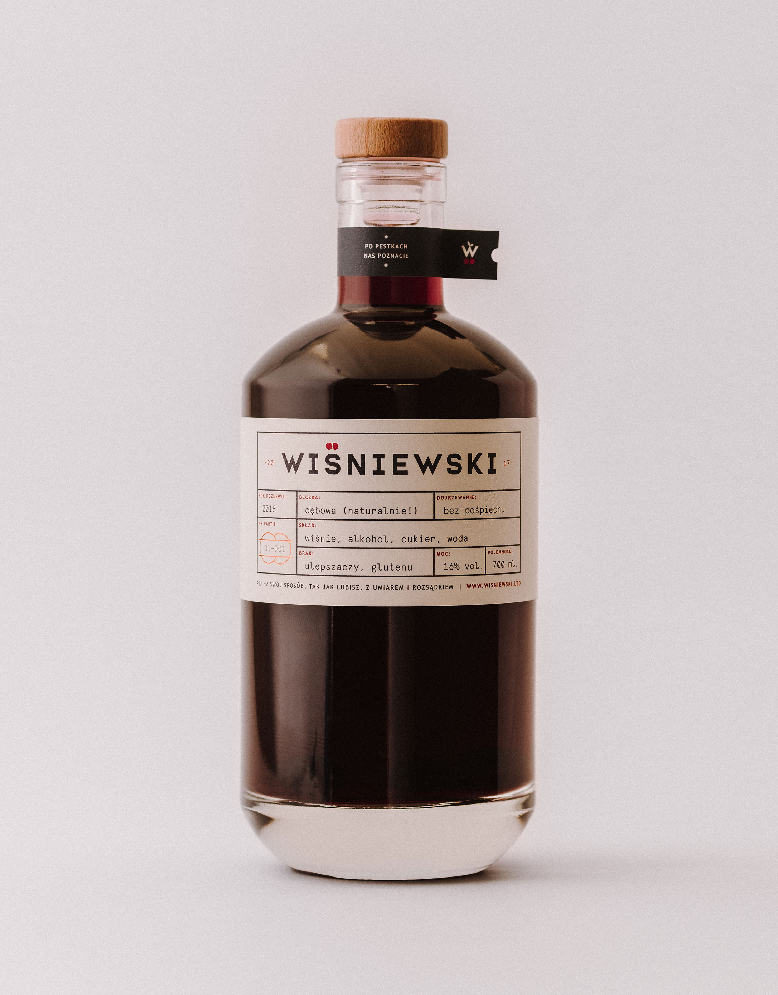
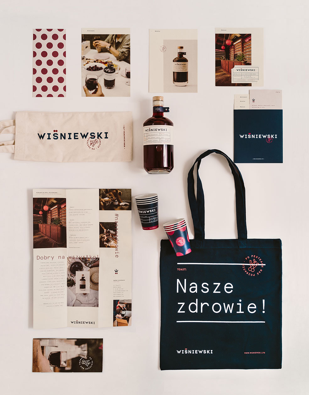
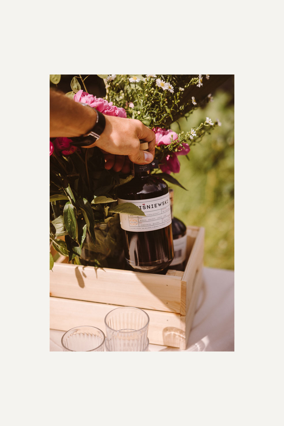
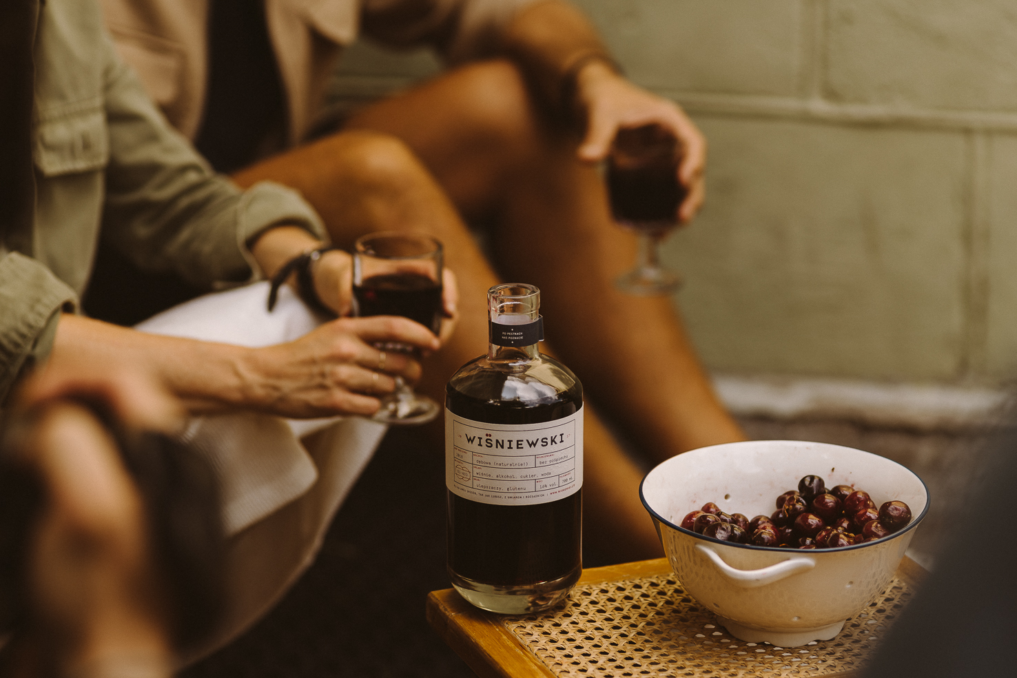
︎ Bottle & Label ︎
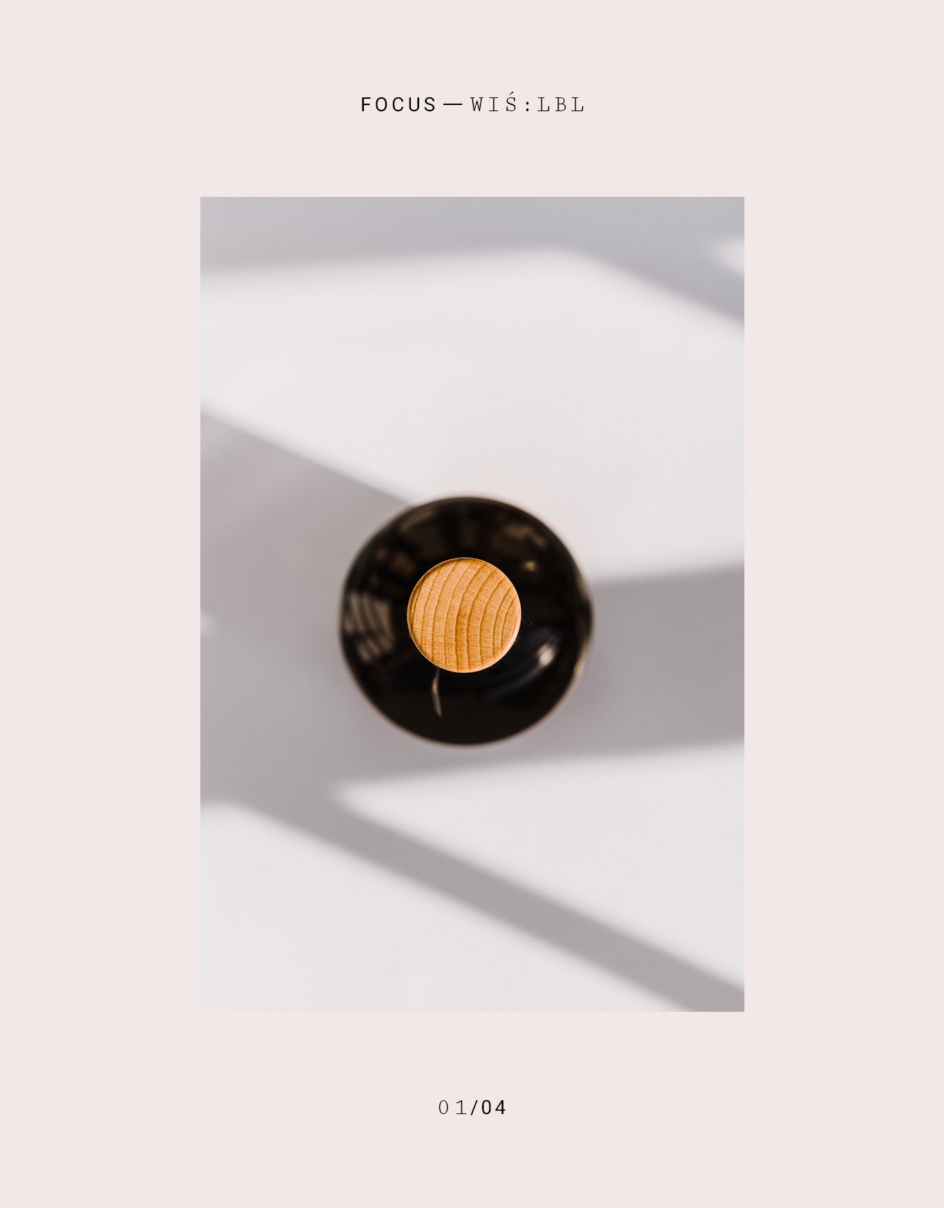
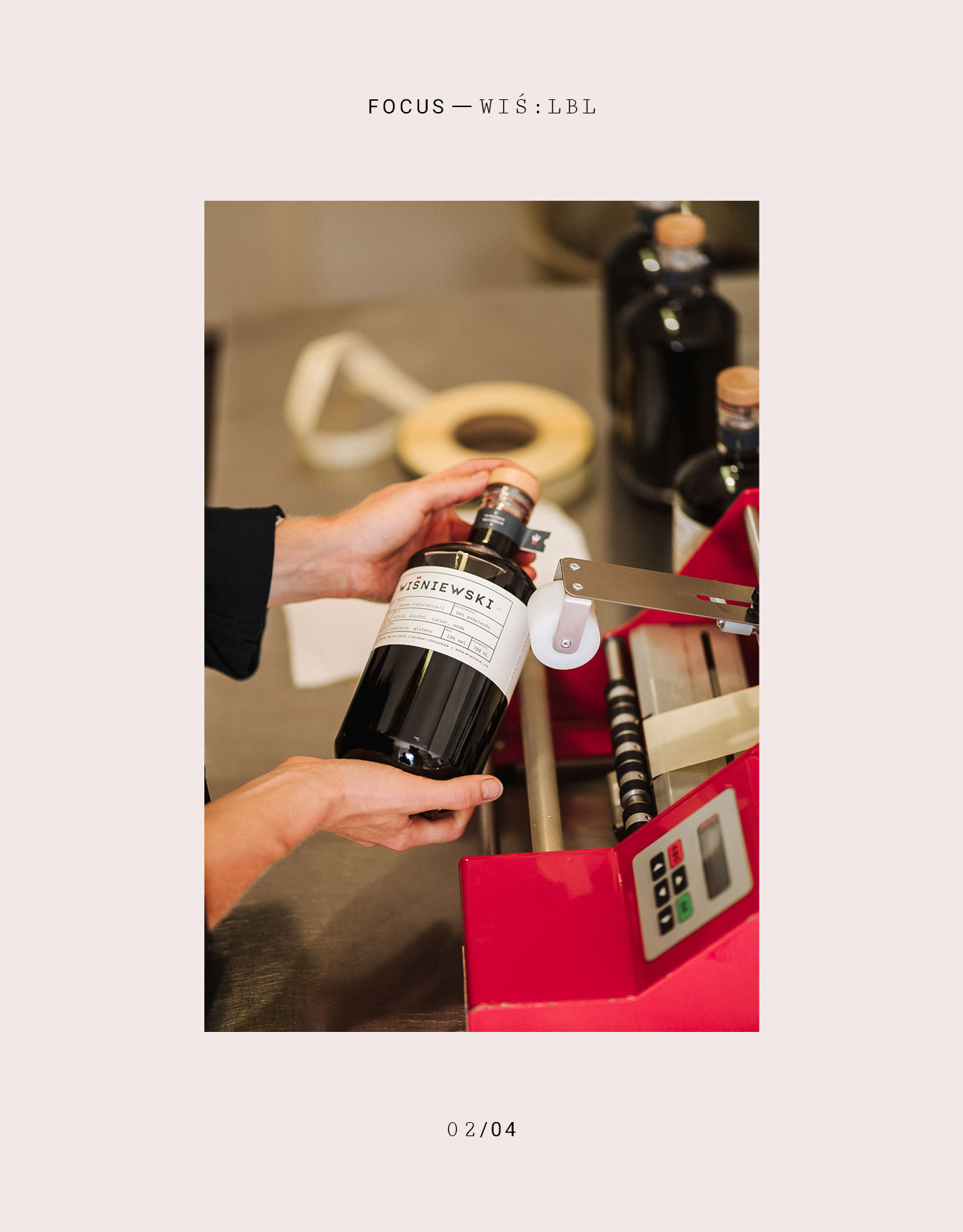
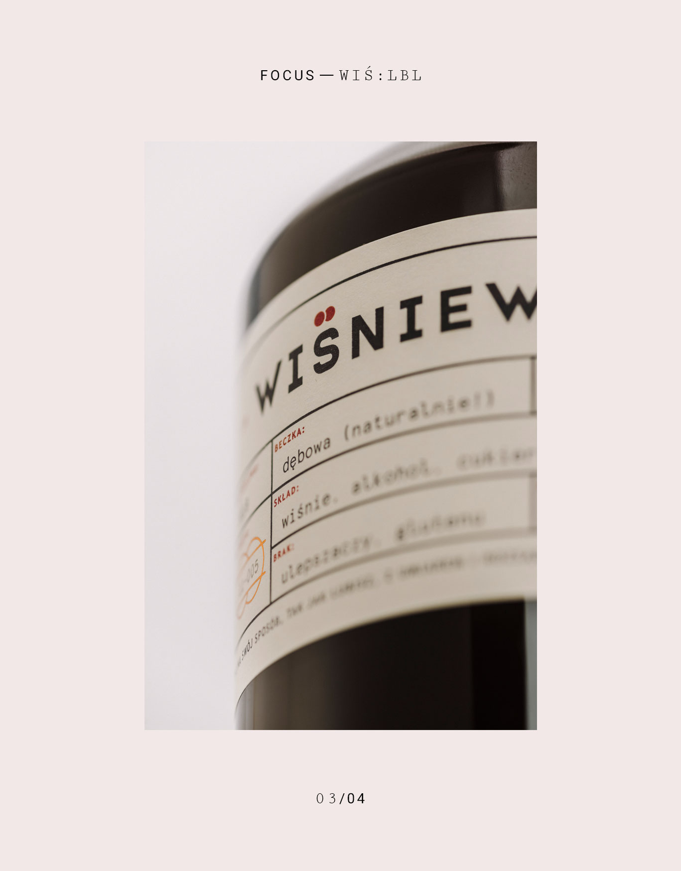
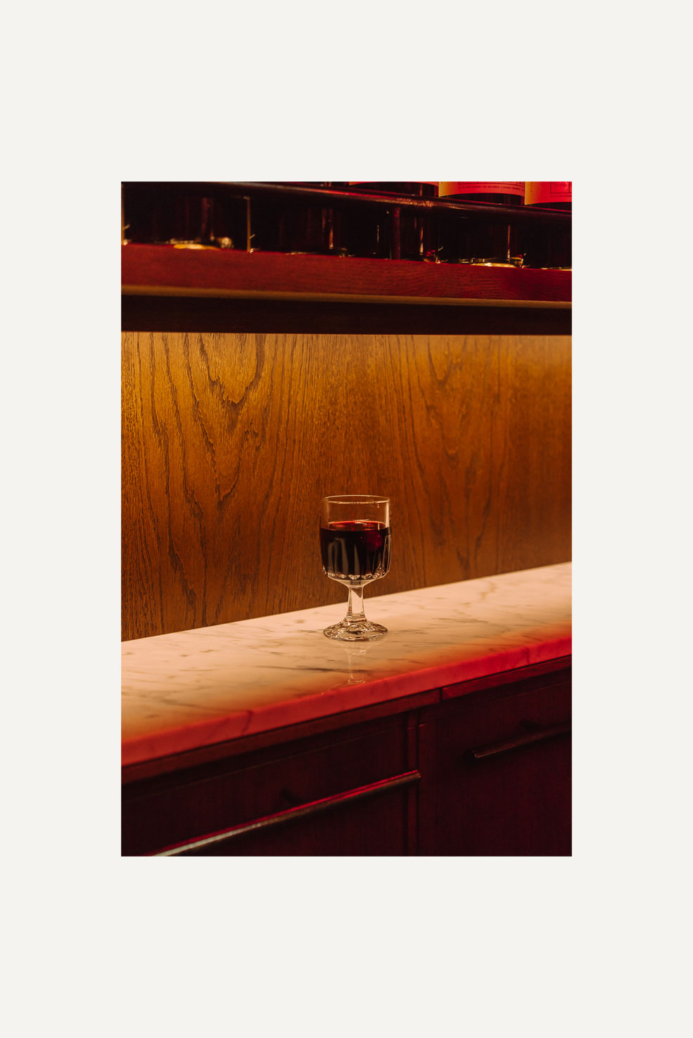
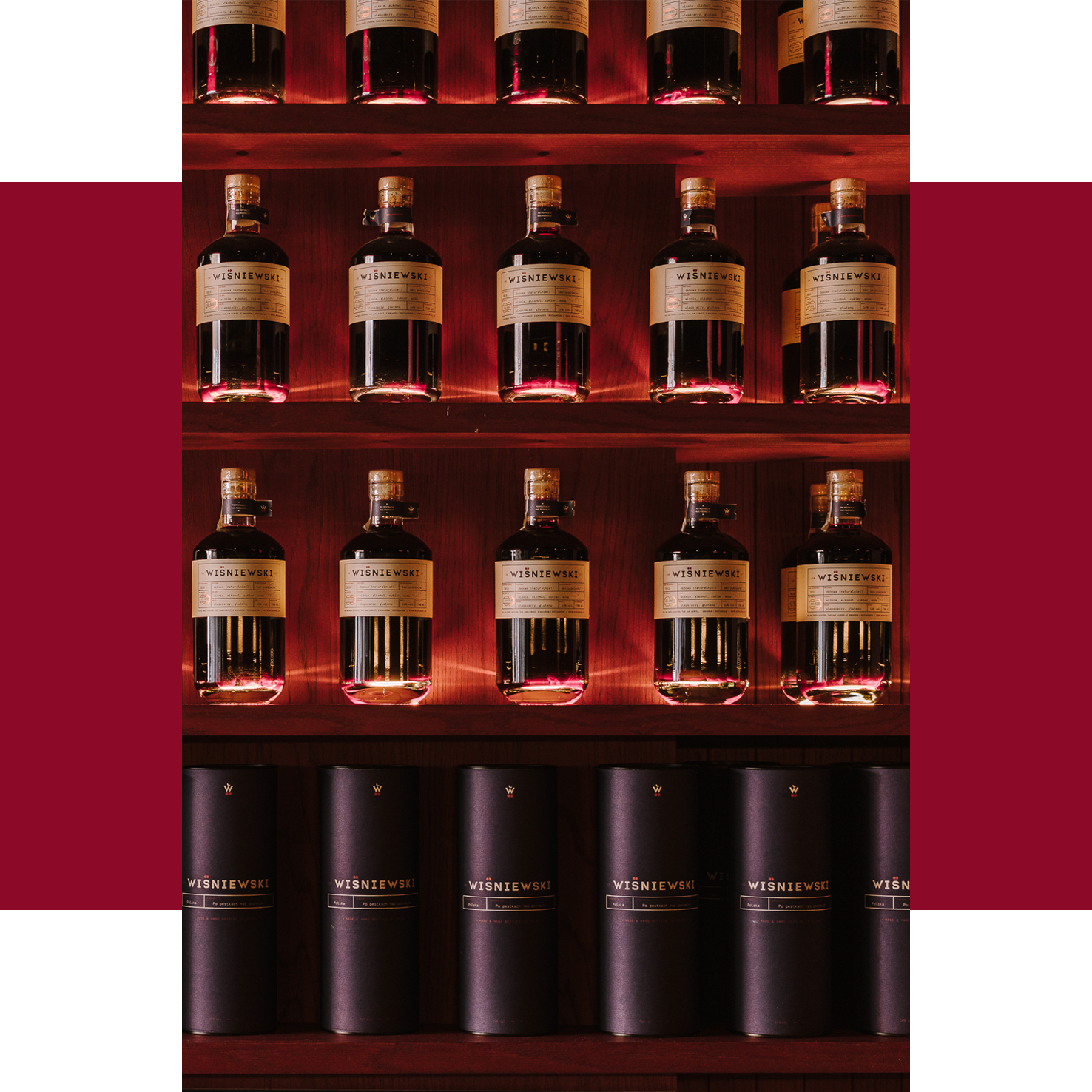
When a spirit company has no history, heritage, nor tradition it could draw from, the visual often becomes as important as the product itself. We knew the way the bottle and label looked and felt were vital to spark curiosity and a certain level of trust with the end consumer. Our solution is a hefty, thick glass, bottle with an oak topper, and two paper labels that wrap around the entire bottle. The weight of the product gives people a sense of quality and craftsmanship. For print, we went with a natural, ivory-colored paper stock which worked realy well with the embossed seal and copper hot-stamped details placed within a simple grid reminisent of old perscripiotns. Deliberate references to aesthetics associated with 19th-century pharmaceuticals are confidently juxtaposed with craft-specific elements creating a high-end product without being elitist.
When a spirit company has no history, heritage, nor tradition it could draw from, the visual often becomes as important as the product itself. We knew the way the bottle and label looked and felt were vital to spark curiosity and a certain level of trust with the end consumer. Our solution is a hefty, thick glass, bottle with an oak topper, and two paper labels that wrap around the entire bottle. The weight of the product gives people a sense of quality and craftsmanship. For print, we went with a natural, ivory-colored paper stock which worked realy well with the embossed seal and copper hot-stamped details placed within a simple grid reminisent of old perscripiotns. Deliberate references to aesthetics associated with 19th-century pharmaceuticals are confidently juxtaposed with craft-specific elements creating a high-end product without being elitist.

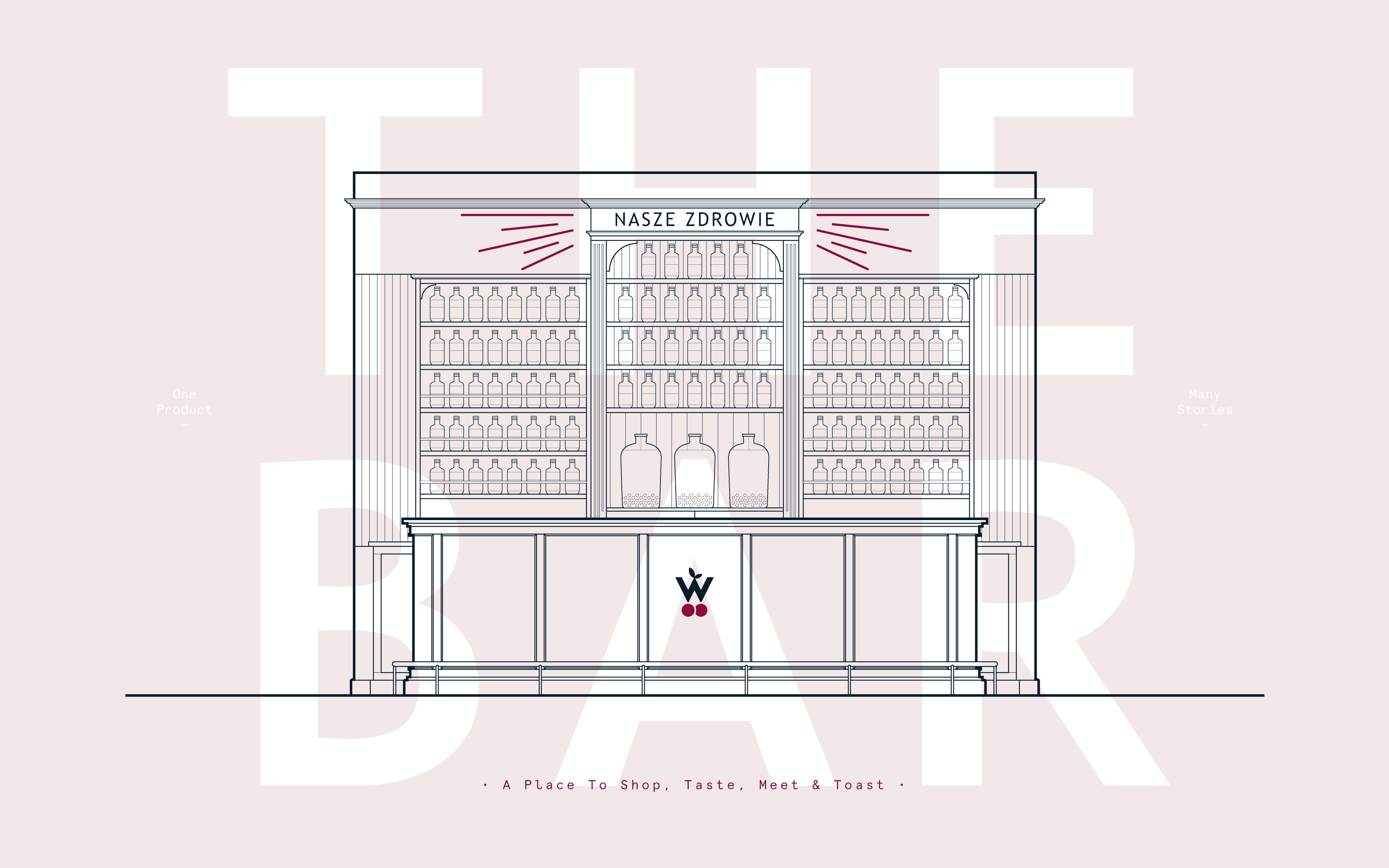
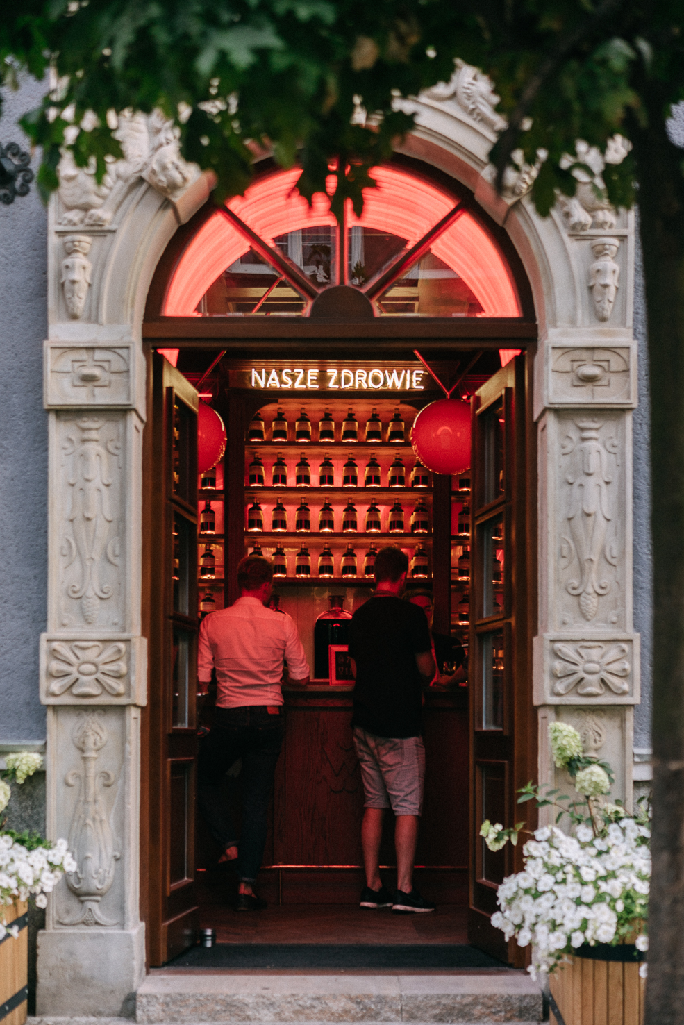
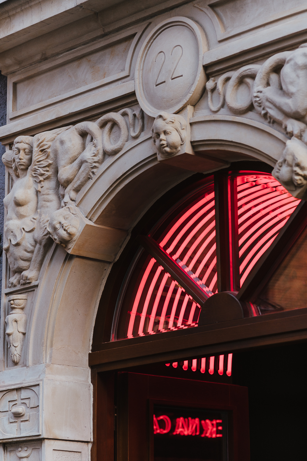
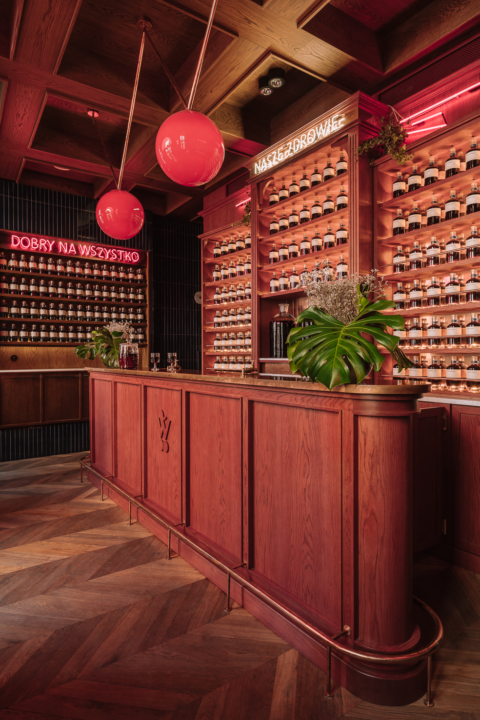
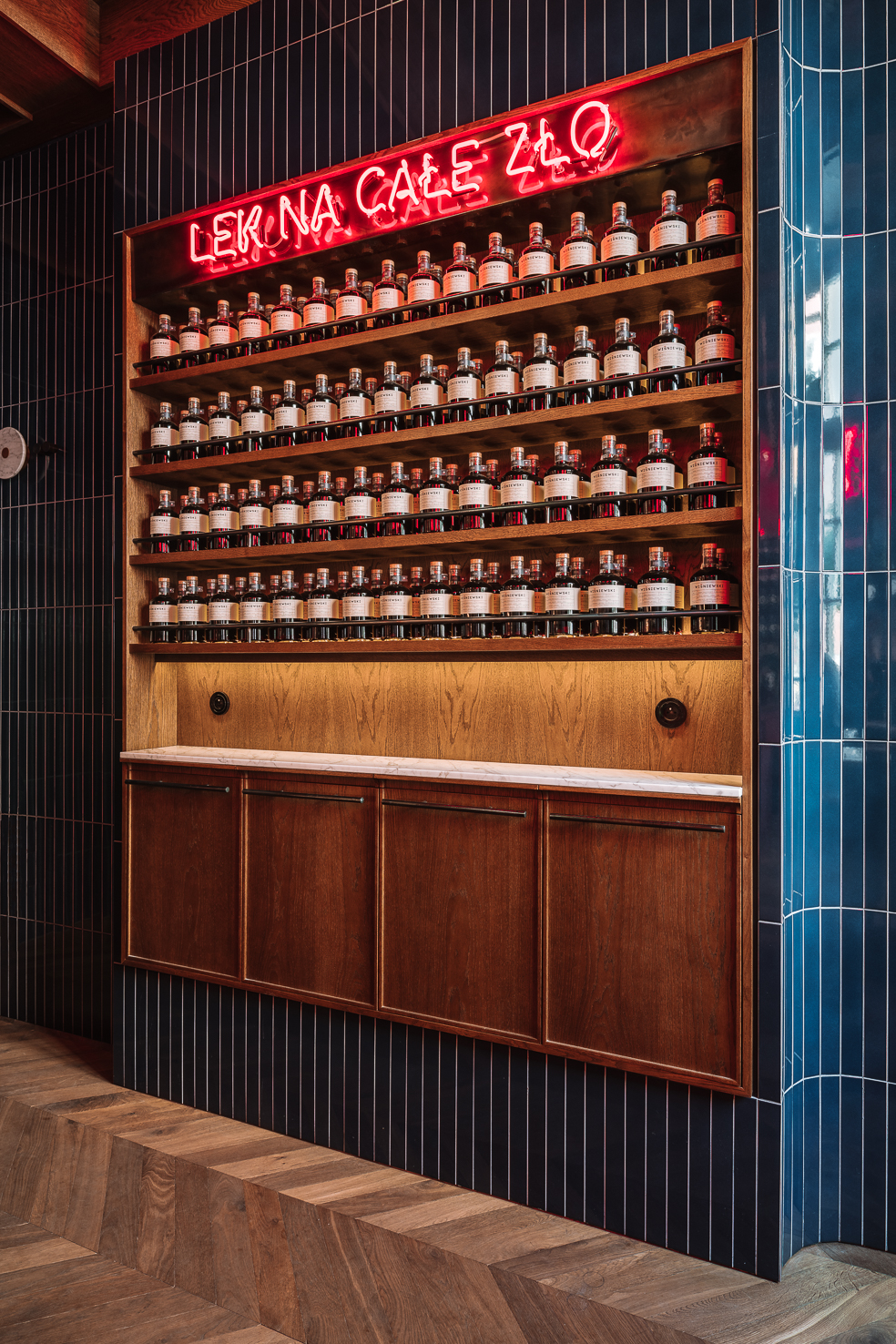
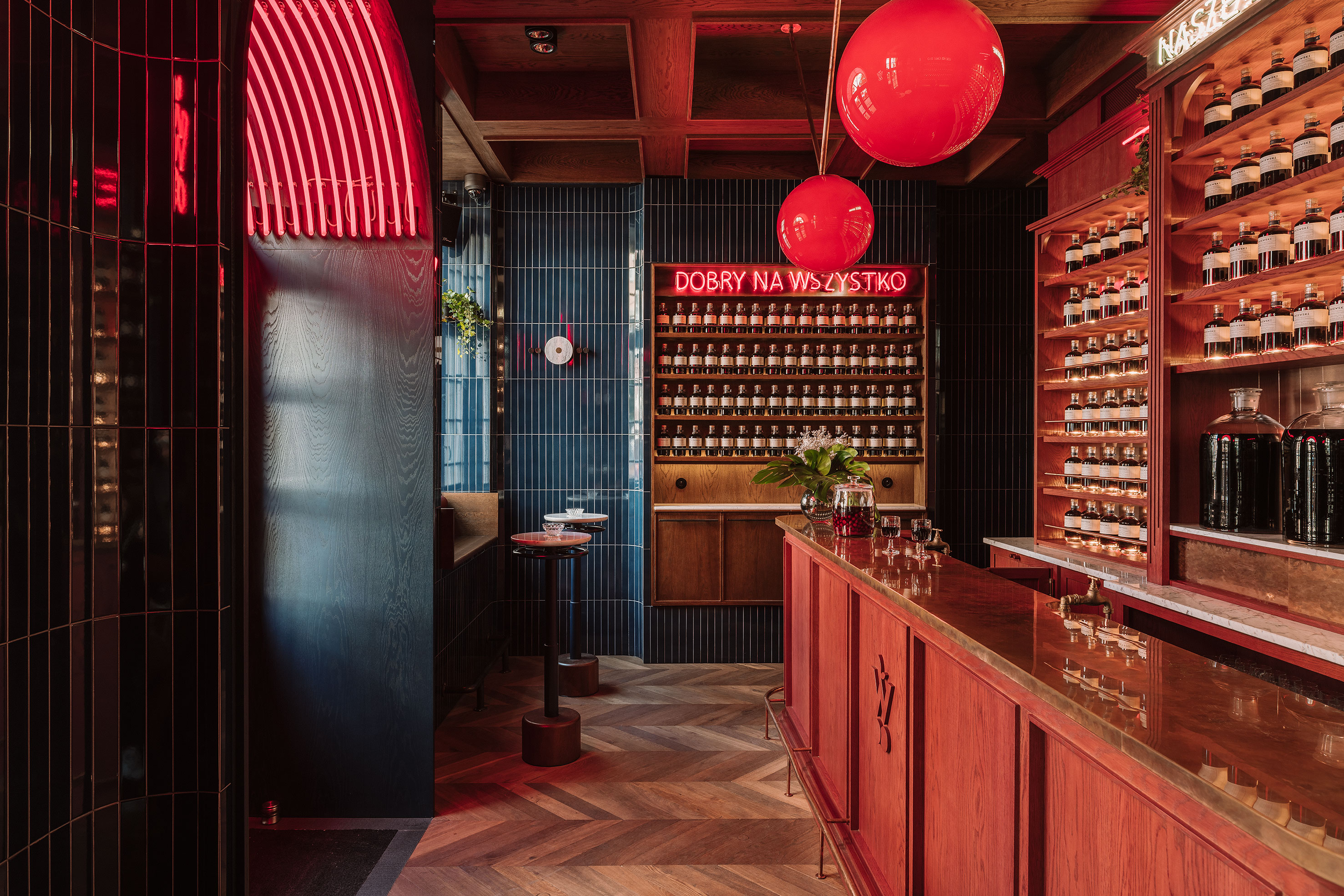
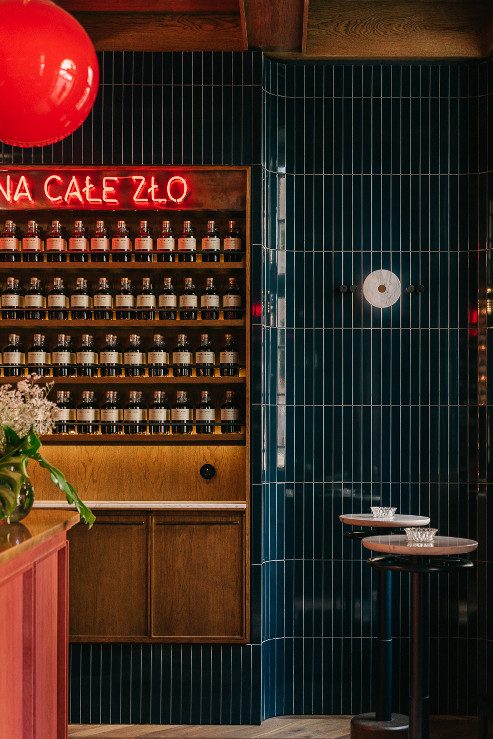
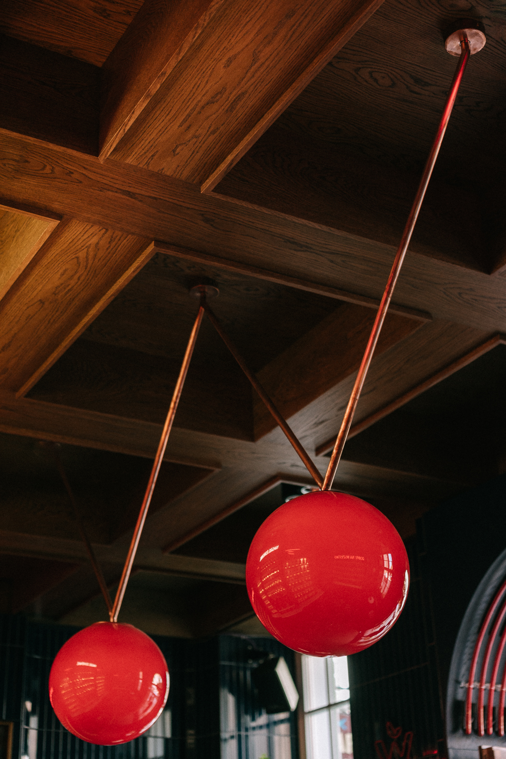
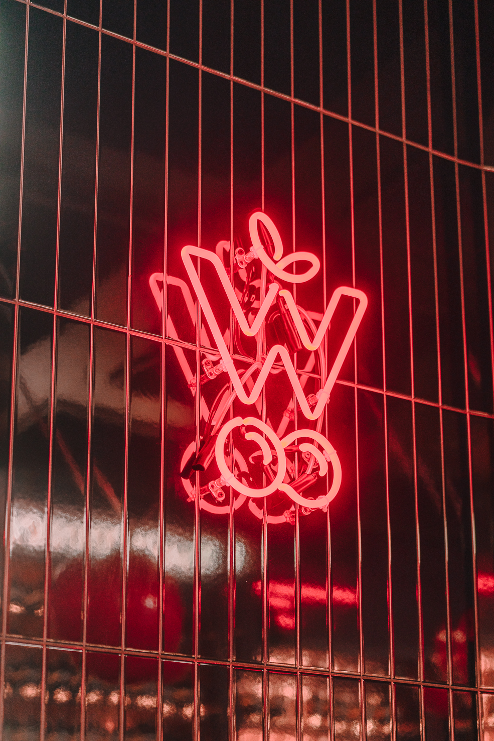
︎ Piwna 22 Street, Gdańsk ︎
At this address, in the heart of the Old Town, tourists and locals are welcome to taste, buy, and share their stories with Wiśniewski. Neon signs (”Cures All”, “Helps With Everything”) mounted on top of meticulously built-in shelves which are filled to the brim only with bottles, reassure guests that they are indeed in good hands. A shop and bar in one - as far as we know this concept is unique on a national scale. Since completion, the brand has continued its growth with the opening of its second venue in the city of Poznań.
More locations coming soon!

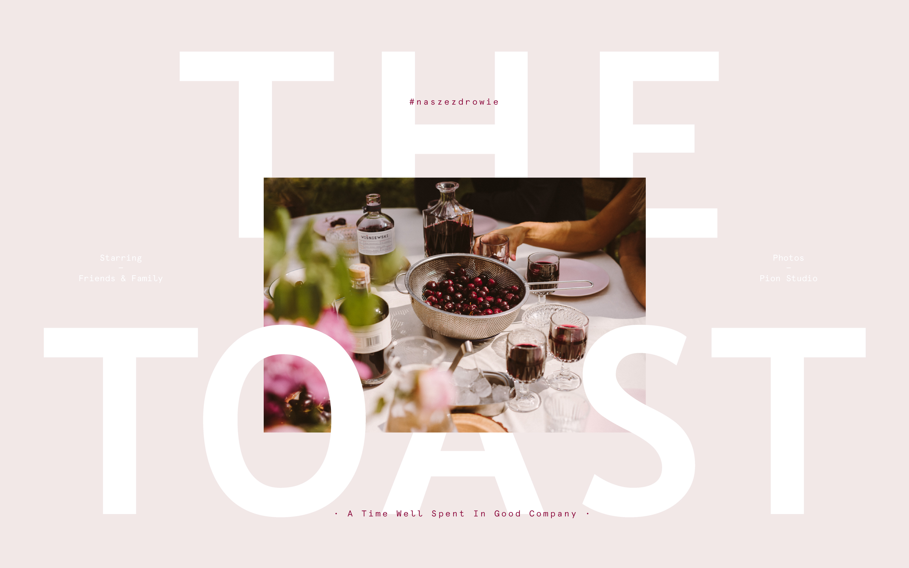
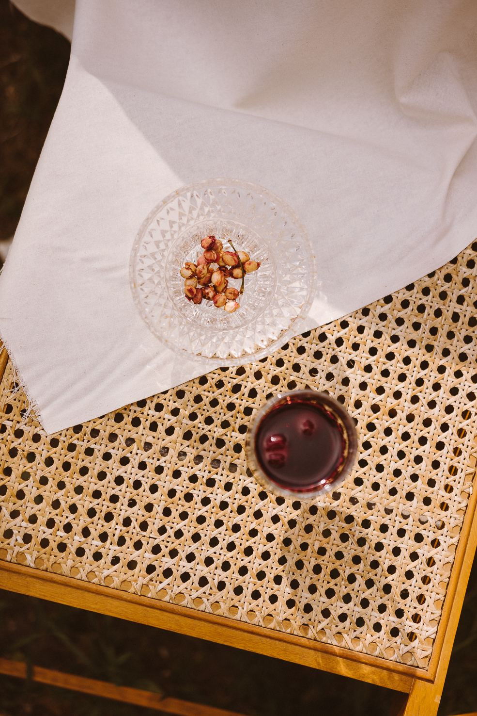
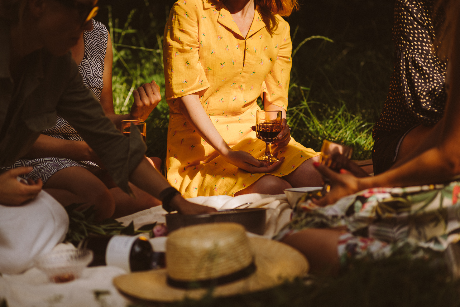
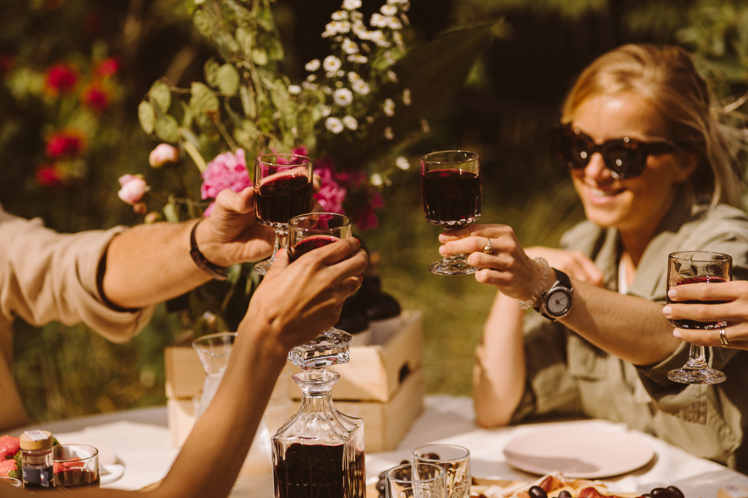
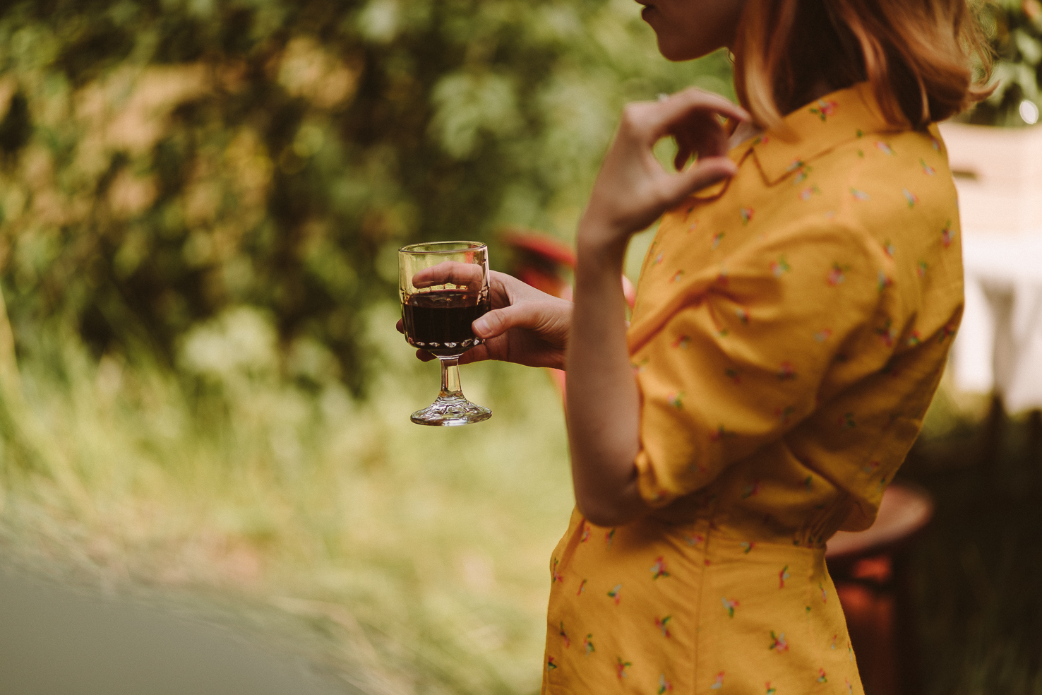
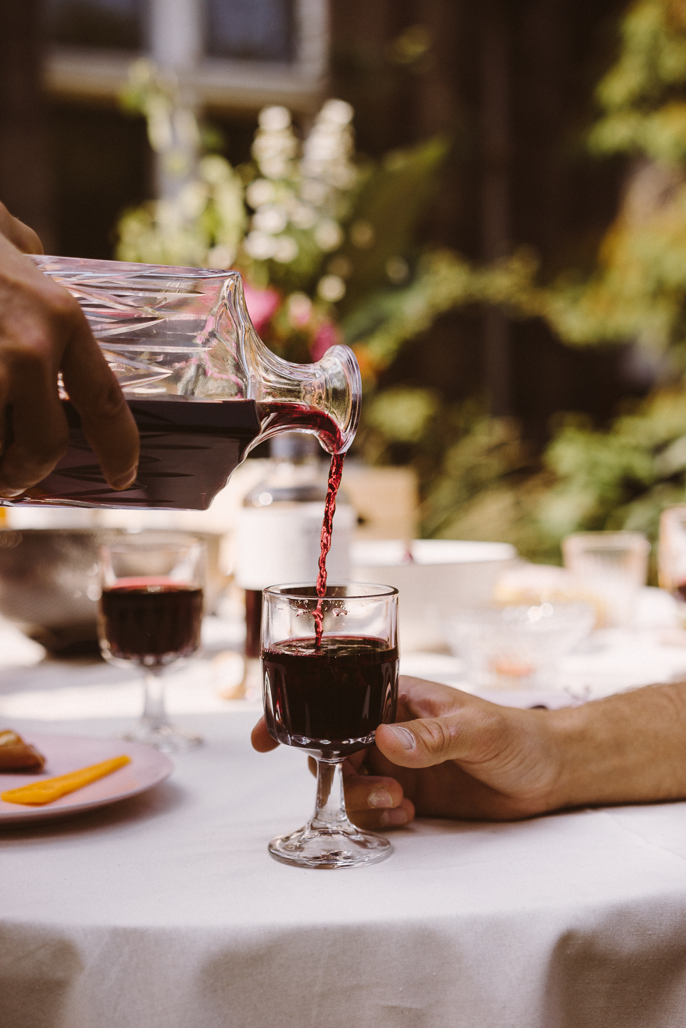
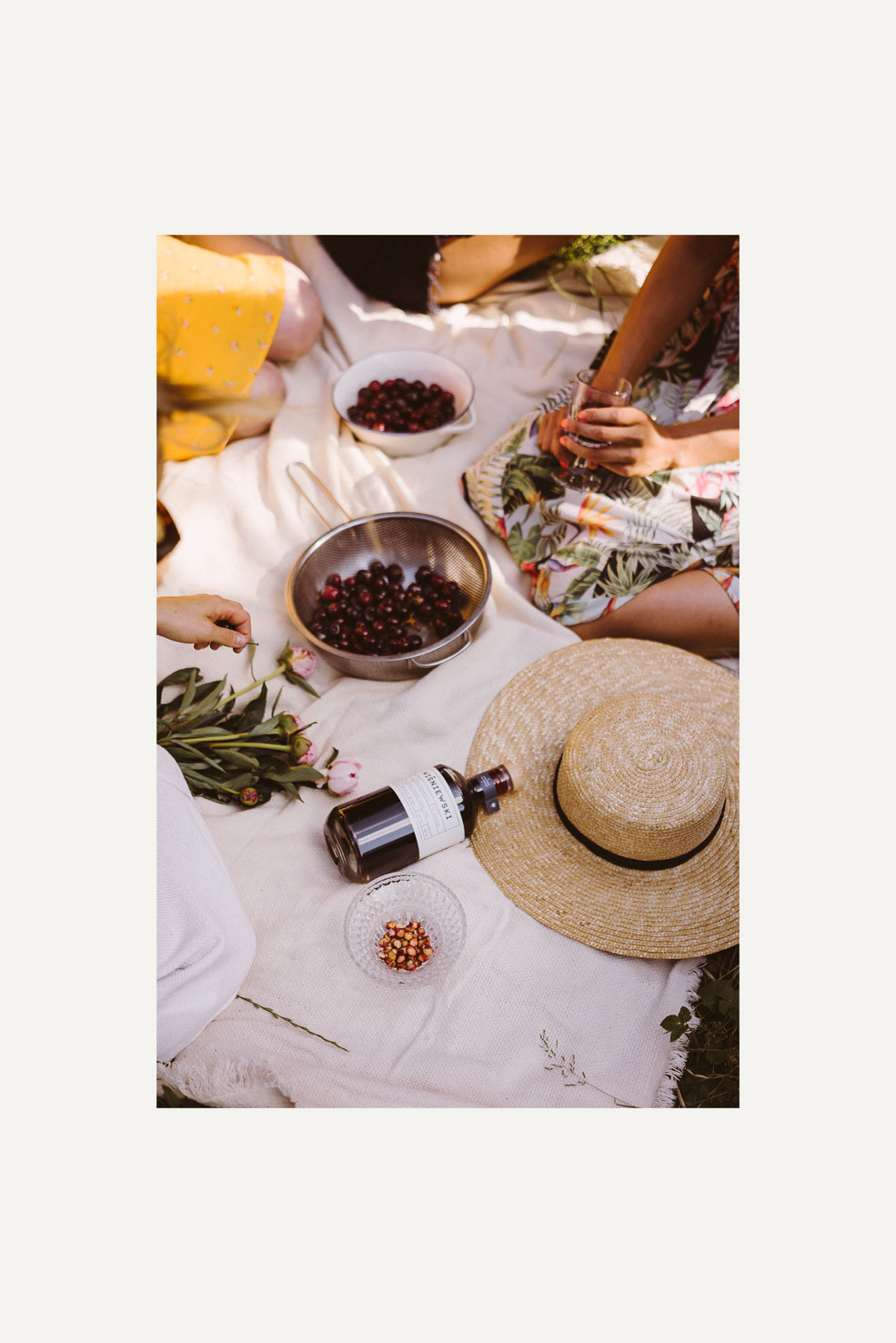
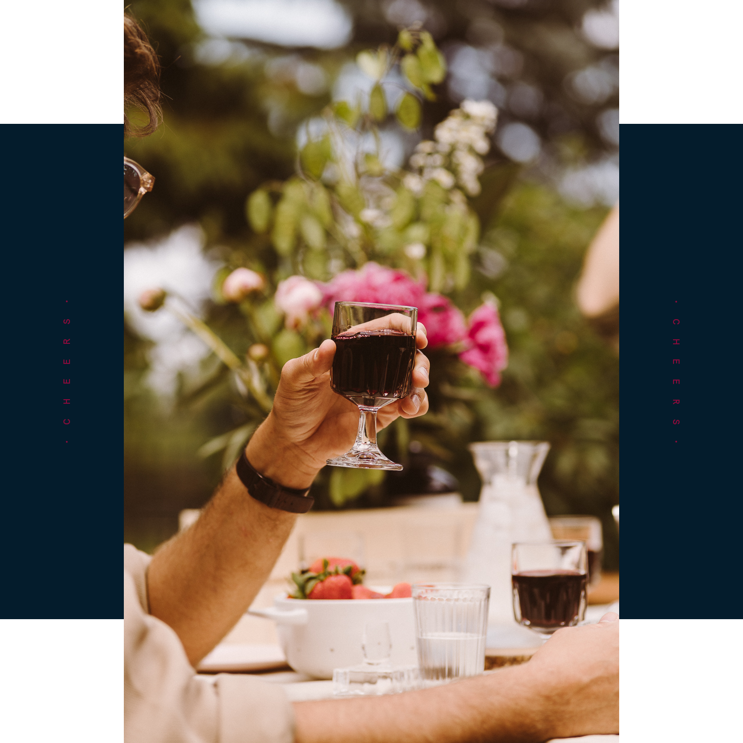
︎ Garden party themed photo shoot ︎
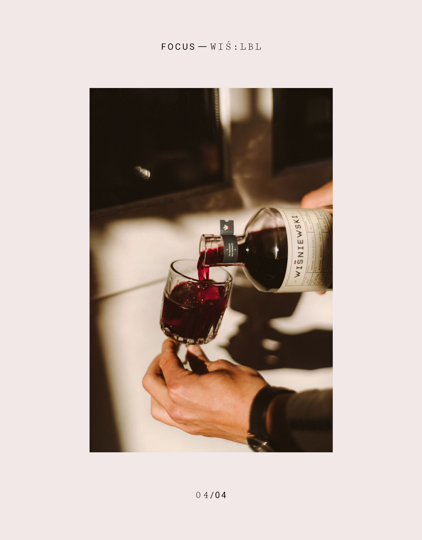
Good photos help exemplify an overall mood of a brand and are often a crucial part of its identity. Our goal was for the pictures to echo the brands’ core values: sincerity and openness therefore we wanted to focus on something everyone can relate to - a common feeling. Simple, authentic, but at the same time very special and fleeting, especially in the age of the internet and limited human interactions. After all, what’s better than spending quality time outdoors, on a sunny day, with a bunch of close friends, accompanied by good food, better stories, sincere laughs, and a glass half full of Wiśniewski?
Good photos help exemplify an overall mood of a brand and are often a crucial part of its identity. Our goal was for the pictures to echo the brands’ core values: sincerity and openness therefore we wanted to focus on something everyone can relate to - a common feeling. Simple, authentic, but at the same time very special and fleeting, especially in the age of the internet and limited human interactions. After all, what’s better than spending quality time outdoors, on a sunny day, with a bunch of close friends, accompanied by good food, better stories, sincere laughs, and a glass half full of Wiśniewski?
We would like to raise a glass and toast everyone who made this shoot as awesome as it was:
Maja, Marcin, Monika, Mateusz, Ola, Adam, Marta, Maciek, Marta, Basia, Przemek... Thank you!
#NASZEZDROWIE
︎︎
Maja, Marcin, Monika, Mateusz, Ola, Adam, Marta, Maciek, Marta, Basia, Przemek... Thank you!
#NASZEZDROWIE
︎︎